Real-life examples of thoughtful design
- Last Updated : April 10, 2025
- 174 Views
- 6 Min Read
Low effort and high ease of use are two things customers expect from any product or service they pay for. Minimum steps to accomplish a task, intuitive ways of handling the product, and easy troubleshooting methods—these are all things that customers, regardless of their demographics, expect and appreciate. The only way to provide your customers with these is through deep, thoughtful research and a comprehensive approach towards design and problem-solving.
This article will look at a few examples of such thoughtful and highly useful design implementations from brands across the world.
First, consider some great design ideas related to physical products.
President butter 100 gm (3.5 oz) block wrapper
This is something that I noticed while using a 100 gm block of butter manufactured by a French dairy brand called President. The butter is wrapped in a sheet of golden-colored paper and has the word "10 gm" along with a small black line printed nine times at equal distances. So if you're cooking or just making toasted bread, you can just cut along the first black line and get 10 grams (0.3 oz) of butter. Or if you need more butter in quantities that are multiples of 10, you can cut accordingly instead of having to weigh it using a scale. What a neat idea! A tiny addition that saves time and effort.

Takeaways
- Design ideas need not always be grand or ground-breaking. Even the simplest and tiniest tweak can enhance CX greatly.
- There isn't always a need for extra apparatus to meet common requirements. You can work with what you have to give your customers what they need.
Ink bottle by Endless
About a year ago, there was a pen show in my city. Yes, you read it right, and it's exactly what it says—an exhibition meant just for pen manufacturers. Over 30 companies sold their wares at the event, but the one that captured my attention was an ink bottle by this company called Endless. Unlike traditional ink bottles, the middle portion of this bottle's base curved outwards, enabling the bottle to do mini pirouettes on its stand. You might think that this is an impractical design choice that defeats the very purpose of an ink bottle, but the literal flip side of the stand contains the solution. One side of the stand is flat, setting the stage for the pirouettes, while the other side contains a circular groove that holds the curved base in place and makes the bottle stand steady.
Furthermore, since ink is a colloidal suspension, the container has to be shaken once in a while so that the solid particles can blend with the liquid. In the case of a traditional ink bottle, users have to lift the bottle and shake it. However, this new design makes this blending process easier and look more elegant.
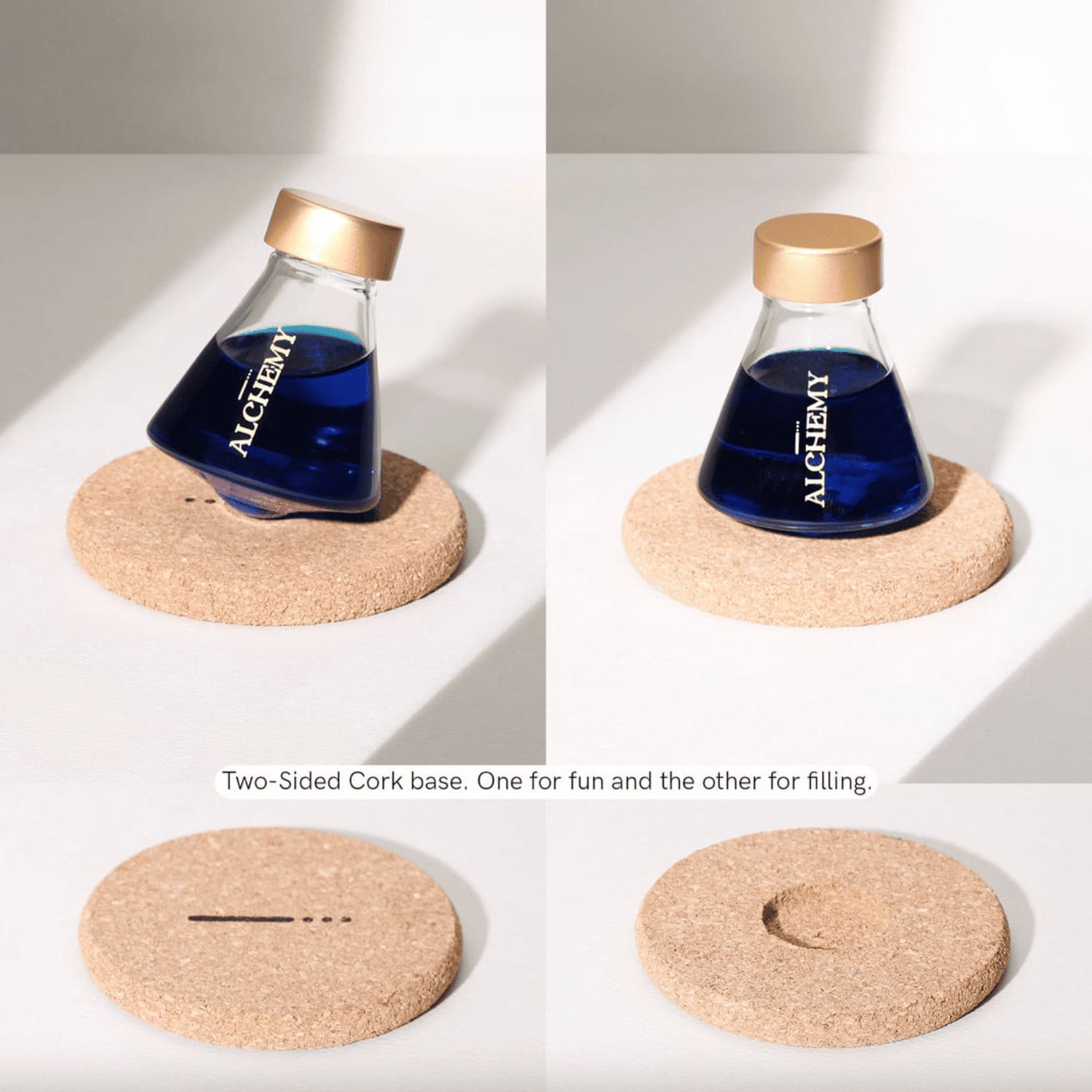
Looks fun, doesn't it? I ended up purchasing one right away!
Takeaways
- Both form AND function are crucial to design. It's essential that you strike a balance between the two in whatever design choice you make.
- In most cases, an element of fun impacts customer experience positively. So don't shy away from experimenting on those lines. Customer satisfaction is good, but customer joy is even better.
IKEA's instruction manuals
I'm a big fan of DIY offerings, and that naturally made me visit the nearest IKEA store (which is about 221 miles away!) a couple of months ago. It was our first-ever visit to an IKEA store, and we were impressed by the variety of options available. Besides simple stuff like cushions, flower pots, and glass containers, our major purchases included a two-seater sofa, three desk chairs, and a shoe rack.
When the time came for assembling them, I was skeptical about the effort I'd have to put in, but boy, I was amazed by how easy and wholesome the experience was. All of it made possible by the clear-cut illustrated instructions in the manuals—heavy on visuals, minimal on text. The manuals also listed the types and quantities of screws, bolts, washers, and other materials in the corresponding packages. Thanks to the clarity they offered, my 9- and 6-year-old nephews and I were able to get the pieces of furniture up and ready within a couple of hours.
Takeaways
- When it comes to user education, choose the instructional medium based on the offering. Whether it's a visual medium or textual medium or a mix of both, the instructions and sequence must be clear and easy to grasp so there's no room for assumption or confusion on the customers' part.
- Specify prerequisites, like required tools not included, clearly before getting into instructions. That way, your customers can get started with the activity and just go with the flow. There won't be unexpected surprises midway.
Now that we've seen a few examples related to physical design, let's look at a few that relate to software design.
Highlight feature in the Kindle app
If Amazon's Kindle line of devices made paper-based books redundant, their Kindle mobile app has made even those e-book readers redundant. The Kindle app leverages the immense convenience that smartphones offer, and delivers a good reading experience.
One of the things that I find beneficial in the app is its highlight feature. You can select specific portions of text and highlight them in different neon colors, much like how you would do using actual highlighters on actual papers. Furthermore, you can add notes to each highlighted text chunk and access all annotations from a single section within the app called Annotations. With such thoughtfully designed features, is there any wonder that the app has over 100 million downloads, 3 million reviews, and 4.6 out of 5 stars just on Google's Play store?
Takeaways
- If your product or service replaces a well-established, widely used offering, make sure it retains certain critical aspects of the experience. Change can be disruptive, but it doesn't need to be unpleasant.
- Smartphones and mobile apps provide great scope for innovation. Invest a great deal of time and effort on UI/UX design.
Lock option for voice notes in WhatsApp
This is an incremental change that WhatsApp introduced for its voice notes. Before this feature came into existence, users had to press and hold the mic symbol on the screen for the entire length of the voice recording. Even a tiny movement of the thumb would either send the note before it was recorded fully or stop and lose the recording inadvertently. By introducing a lock feature that keeps the recording going without requiring users to hold the mic symbol throughout, WhatsApp put an end to this issue. Users just have to start recording a voice note and then swipe up on the lock icon that appears. This minimizes the effort required and lets users record their voice notes easier.
Takeaways
- Design is never a one-time effort. Keep researching and listening to customer feedback to make incremental changes in your offering.
- Effort and experience have an inversely proportional relationship. The more effort needed, the less positive the experience, and vice versa.
Color-blind mode in Pudi
This is a thoughtful, inclusive option that I noticed in a simple mobile game called Pudi created by Jambav, Inc. The game involves two small, differently colored circles falling from the upper half of the screen. The lower half displays four bigger, differently colored circles arranged in two rows. Each of these big circles contains a smaller circle of the respective color within. The objective of the game is to move and manipulate the bigger circles such that they match the colors of the smaller circles falling from above and catch them correctly. Thus the name Pudi, which means "to catch" in Tamil.
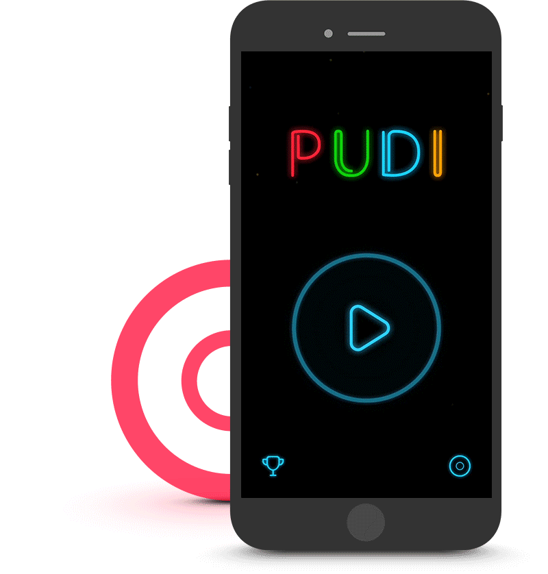
A fun game for sure, but I was surprised to see a "Color Blind" mode in its settings. When this mode is on, the falling objects are not all circles anymore. The same applies to the smaller circles inside the big circles on the lower half. Each color gets a different shape associated with it, yellow - square, blue - triangle, red - circle, and green - rhombus.
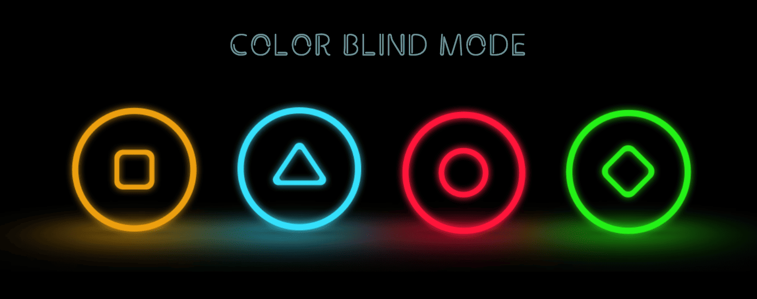
Now, the objective is to match the falling shapes with those at the lower half and catch them correctly—a way to enable color-blind users to partake in the fun. Again, neat, isn't it?
Takeaways
- Always, and we mean ALWAYS, consider inclusivity and accessibility in the design process. Your customer base will definitely have people with varying levels of ability. It's essential that you cater to them all equally.
- Form a user group focused on accessibility and use their inputs to design and improve your offerings. That's the only way to do justice to the cause.
As these examples have illustrated, thoughtful design is a key driver of CX excellence. The more time and effort you put into the design process, the more positive and memorable the experience becomes. That's a sure-shot way to impress your customers and make them talk about you.