The stakes are higher for ecommerce websites than for other business websites. As the owner, you need to balance factors such as ease of navigation, and customer satisfaction, while focusing on conversion and driving purchases. You must place the right content in front of the audience or risk losing their attention to more interesting websites. You shouldn't just create product pages, set up a shopping cart, and hope for the best. You need to set up pages wisely to catch your visitors' interest, keep them engaged longer, and convert them to paying customers.
In this post, we'll help you decide which pages your ecommerce website should include to craft a compelling online experience that makes people want to shop.
About Us page
You might be surprised how many ecommerce websites skip the About page. It's important, though—this is the space for you to shine and connect with your customer emotionally. Treat it as an opportunity, and really make that connection, because customers buy based on emotion rather than rational decisions. We recommend you tell your story here—why you started your business, what you are hoping to achieve, and how you intend to make a long-term impact. Your most loyal customers will feel invested in your story and become your brand advocates if they value your product or service. Take your time in writing this page! Spend time articulating your story, make it emotionally appealing, and notice how much more fully your customers engage with your brand.
Example: Bentley Motors has a great About Us page where they celebrate their values linked to their history. They talk all about how they have reached where they are today.
FAQ's page
It is natural for a potential customer to have questions. Customers will not purchase an item if they haven't had their questions answered to their satisfaction. Most of the time, though, visitors do not take the effort to reach out to ask those questions, and would rather switch tasks or visit a competitor’s website. So the best way to ensure your customers get their answers is to create a dedicated page for questions that you encounter frequently. Don't include just the most common queries, but also the most practical ones. These helpful answers create confidence in the product and ease the workload on the customer service team.
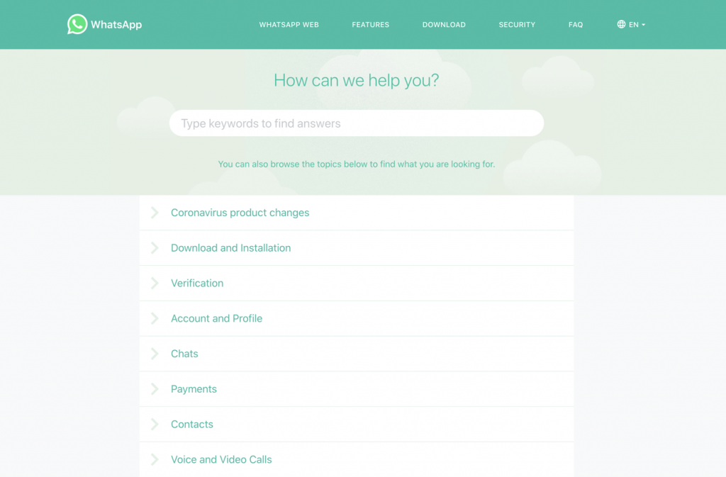
Example: Whatsapp has the perfect FAQ page for their app. It's appealingly bright and has a search bar which makes it easy to find a particular answer quickly. It is also categorized effectively for both desktop and mobile versions using auto-responsive technology thats allows the pages to adjust based on each device and its size.
Categorization & Navigation
Imagine how products are sorted into aisles in a retail store in your line of business. For instance, in a supermarket, the aisles are clearly marked as fresh produce, cereals, beverages, and so on. Your ecommerce website is similar. It needs organizing, so visitors can browse within the specific product category they're looking for. So design your website's navigation well, and arrange your products in categories and subcategories.
It is also important for customers to feel familiar with the navigation. Every industry follows some standard categorization—for instance, apparel stores have categories for men, women, and children, followed by the type of product like shirts, trousers, and so on. It is usually best to follow your industry's standard practice, so that users recognize the navigation and find it easy to follow. However, if you do break with the norm, keep your navigation simple, as the users will need to learn the new navigation parameters on their own.
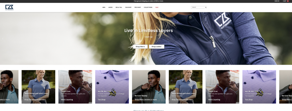
Example: Cutter & Buck, an online sportswear store, has used multiple levels of categorization. The first level is based on build, the second level is based on gender, and the third level is based on design type. This way customers can easily narrow down the categories to find the items that appeal to them.
Privacy policy & terms of service
Transparency in handling customer data is essential. Customers may not actually understand the importance of all the clauses mentioned in the privacy policy ansd when they click on 'Accept'. However, you need to maintain a space on your website that clearly articulates your terms of service and privacy policy. How do you ensure the confidentiality of personal information? What security standards do you use when processing payments? The hard and fast rules of customer relationships and clauses for the termination of an agreement should all be mentioned here. All this keeps you in a legally safe zone in case of any disputes. Your terms of service can clarify your position in areas such as IP rights, dispute resolution, what a user agrees to when using your service, and what the ecommerce terms on your website mean, among other things.
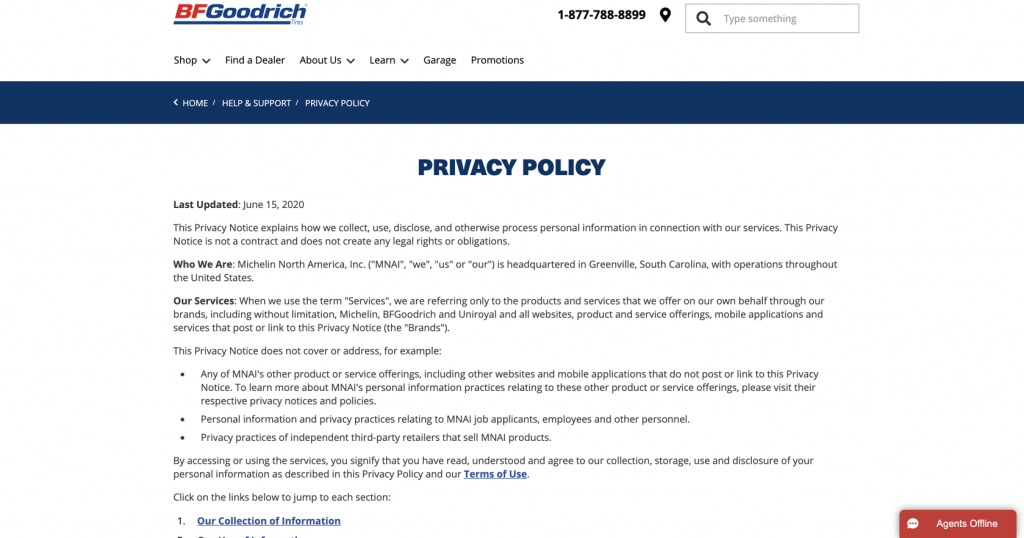
Example: BFGoodrich Tires has a perfect privacy policy page that includes all the major points related to personal information and privacy in its online store. It's a good model to keep in mind while designing your own privacy page.
Contact & Social Media
In ecommerce, customers want to be able to contact the store instantly. The success of your business depends on the support you offer before and after purchase, so you should offer many different ways to communicate with your teams, such as email, voice, and live chat. Live chat is a good way to keep the communication open 24x7 if you can ensure consistent staffing. You can program a chatbot to answer the most generic queries, but it is best to have real people engage with customers directly. Your chat boxes should appear on the most important pages of the website, such as the home page and the individual product pages.
Dedicate a page to showing your contact information and the various ways a customer can contact you. List your business email address, phone number, postal address, and even a map for your retail store. Provide links to your social media handles on your website footer and the contact page so that all your website visitors can stay connected with you on their channel of choice, whether that'sInstagram, Facebook, Twitter, or YouTube.
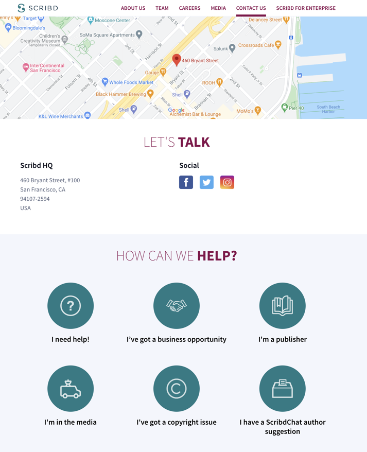
Example: Scribd is your go-to place for online reading, and its Contact Us page is beautifully designed using three sections. A map shows their exact location while helping people navigate easily to their office. The second section connects Scribd readers to the social media platforms of their choice with one click.
Return policy
Returns are an important part of ecommerce, and your website needs a dedicated page for your product return policy. Whether your products qualify for a return or not, 60% of your customers are likely to check what the policy says, so having this page set up and easily accessible is necessary to give your customers a good experience.
Transparency is good business practice. A well-articulated return policy ensures that your support team does not need to explain the return terms to individual customers.
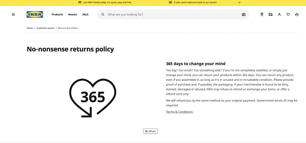
Example: IKEA has an amazing 365 days return policy where a customer can choose to return his purchase if he doesn't like. They have an easy to comprehend page with very simple instruction on how to proceed with returns. The simplicity of returns is one of the biggest factors that allow your customers to experiment with newer ecommerce stores.
Stories & Blog
Not all brands have a story, but brands that intend to get close to their customers and be part of their daily lives should have one. A story is how you connect your business with a customer and their ideas. A story can educate, entertain, or enable your customers to achieve things that they need but doesn't know that they need it yet.
Along with your story, a blog can go a long way in establishing a deeper connection with your audience. Get creative with blog ideas! You can have stories about your products in use, talk about the impact your business is making in the larger world, or show your customers what it is like for people to work with your brand. Add testimonials to the mix, whether as part of your blog content or as a separate section, for social proof of why people choose you over your competition. A blog also has the advantage of adding keyword density to your website, giving you the opportunity to optimize for search engines.
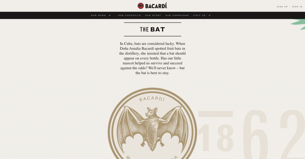
Example: Barcadi Rums have always been intertwined with the lifestyle of the Caribbean. They have made the brand symbolic of their culture, and they have always associated their brand with music from the Caribbean, which has a strong appeal for customers worldwide.
Press releases
Although a page for press releases is not necessary, it is nice to have if you want to cater to media houses, or just build extra credibility with visitors. You can use this space to share product launches, or the latest buzz in your company that impacts your customers or community. If you cater to the mass market, press releases can help generate media attention and website clicks.
Example: GE has a dedicated page for their social media mentions and press releases. As a well-established brand that gets fairly frequent mentions in the news, they're right in thinking that it is worth the effort to maintain a press release page.
Product pages
A well-designed, high-performing product page is the holy grail of ecommerce. Every product needs its dedicated page, where customers spend the time to evaluate the product and become convinced of its utility and value. Once the customer is satisfied that they want the product, they should be able to add it to their cart right from the product page.
The purpose of this page is to bring customers from the point of consideration to the point of purchase. In other words, it’s where you convert visitors into (hopefully long-term) customers. The tools you have to accomplish this are clear product photography, compelling description copy, and positive customer reviews. If you put them together well, you’ll end up with a convincing page that will drive your sales and your top line.
Example: Luxy Hair has dedicated product pages for every one of their many product variants. These product pages ooze confidence and include numerous appealing product images. They also include extensive details about product characteristics like color, material, construction, dimensions, styles, and care. Essentially, every aspect of the product except its feel and smell has been included, so the visitor can get to know it.
Think of your ecommerce website as a library for visitors. As the librarian, your ultimate aim is to help the visitor find something they'll like. You can't make them decide to take it, but you can help them navigate their options and make it easy for them to evaluate anything that interests them. And once the visitor has decided that they like something, you can make sure they know what to do next.
If you were running a brick-and-mortar store, you could always have a sales rep guiding your customers through the aisles. However, on an ecommerce website, customers have to find their own way—and if they can't find the information they need, they may just close the tab. If it gets to that point, that is a customer lost for life. But by getting your visitors to the right page, answering all their questions, giving them confidence with clear policies, offering social proof, and showing them the value of your product, you can not only keep them from clicking away, you can actually move them through the purchase cycle faster, which means you realize revenue sooner!
Feel free to drop us an email with your suggestions at marketing@zohocommerce.com




1 comments
The new thing that I have seen is Press Releases, do they make any real difference especially when the store is in the infancy stage?