8 simple tips for creating epic visuals for social media
- Last Updated : July 10, 2025
- 5.3K Views
- 7 Min Read

What is it that you first notice when you hop on to a social profile – be it a personal or business page? Is it the logo or the banner/cover photo? Or is it the pinned tweet with an explainer video?
Whatever it is that you first notice, it’s most likely a visual – a static image, a GIF, a profile image, or the cover photo.
That’s because recent studies show that your brain processes images 60,000 times faster than text. So you notice them first! Eye-tracking studies also confirm internet readers pay a lot of attention to information-carrying images.
This tells us visual content is brilliant at catching and holding attention. But the last thing you want is to leave a craptacular (yes, that’s actually a word) impression on your audience with poor visual content on social media.
So, how can you make epic visuals?
I asked experts exactly that and they had some wonderful things to share. So, let’s talk about their tips in this post. We’ll also see how you can replicate the same.
Here we go:
1. Make consistent visual content for your social profiles
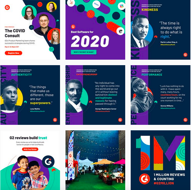
The Content Marketing Associate of G2.com, Daniella Alscher, who is also in charge of the design stuff for their team thinks consistency drives brand awareness. She says, “the more a viewer is exposed to your brand’s typography, elements, and colors, the more likely they’ll recognize it the next time around.”
Not to forget visual consistency makes your social accounts, “aesthetically pleasing to viewers.” So that’s another win.

But wait. What’s consistency in design, again?
Abby MacKinnon, Content Creator at Hoot Design Co., who collaborates with several graphic designers to create social graphics explains, “this means using your brand colors, fonts, and graphics for all of your social media posts.
We like to say that your brand doesn’t change for Halloween, Halloween changes for your brand. What we mean by this is that if your brand colors are pink and green, create holiday graphics that are also pink and green. There’s no excuse for going off-brand with your visuals.”
That pretty much sums up what you need to do – create a brand identity (brand colors, fonts, and the rest of the kit and caboodle) and use it to make consistent visual content.

2. Add some personality to your visuals
The director of Marketing & Operations Manager for TheClose.com, Miranda Paquet, thinks, “great visuals have personality.”
And she comes armed with proof of how personality-imbued visual content can fuel growth. She shares that her company focused on making personality-rich visuals for Pinterest last year, which grew their following to 1.3 million monthly viewers.
How, you ask? In Miranda’s words, “We don’t shy away from quirky and silly images that make a statement. Think: grandma with a martini glass, cute dogs, a pineapple wearing sunglasses, we have it all.”

Now that’s something!
The fact that social is littered with stock imagery gives such content a good opportunity to impress. This content works for other reasons too – it’s bright and memorable (studies suggest that people remember 65% of the message they see visually. Even after three days).
So where should you start? Miranda has just the tip for you, “put yourself in your audience’s shoes and try to create something that will stand out and represent your brand in a playful way.”
3. Add infographics to your content mix
Want 3x more social shares (retweets, Facebook shares, and more pins)? Then take a page from Meg Marrs social profiles. Meg is the Founder of K9 of Mine who has seen incredible results roll in from using infographics in her content.
Infographics generally get Meg three times the shares on social. Here’s an example post on best dog beds. The infographic at the end shows different dog sleeping styles and the best bed fits for those styles.
Meg shared this infographic on social. And Pinterest alone earned her thousands of impressions. Meg discloses the infographic got 1.2k views in its first week alone, along with +30 click throughs.

Hence, Aim to create, “infographics that compile interesting data in unique and aesthetically-pleasing designs.” But a million-dollar questions here is: where will you get these designs from?
I’ve just the tool for you: Visme, an online infographic maker that lets you DIY design work and gives you tons of infographic templates that get you started in minutes.
4. Add videos too
Another visual content type that works wonders for social engagement is video. With 78% of people watching videos online weekly, this makes sense.
James Nguyen, the Content Marketer for Zoma adds more sense to this as he elaborates, “images capture your attention for a split second before you scroll onwards. But original videos give viewers pause, holding their focus for a longer period of time, which can increase brand recognition and long-term recall.”
To achieve this, James and his team started creating videos for their social. For example:
As a result, Zoma saw an 8-20 times engagement on their social channels. And here’s the interesting bit — James isn’t alone in his observations. Nextiva’s CMO, Yaniv Masjedi, shares his team adopted the same approach and tapped into video by creating animated videos like this one:

Yaniv shares their goal was simple: to promote their blog posts. The results, you ask? Phenomenal. In Yaniv’s words, “over the past month, these animated videos have received way more engagement than their image counterparts: 113% more engagement on Twitter, 94% more on Facebook, and 43.5% more on LinkedIn.”
Remember to always keep your video short and get straight to the point. You risk losing your viewer if you dilly-dally. Not to mention, always lean on storytelling for capturing viewers’ attention.
5. Pair your visual with a spiffing caption
Visual and text go hand in glove. That’s a given. However, the key is to pair the duo to elicit positive reactions. Hat tip to Jess Dante, the American-turned-Londoner, Founder of Love and London.
Jess shares, “My team and I focus on creating visual content that elicits emotions like nostalgia, sense of belonging, and being knowledgeable. For example, our visuals that show the main London icons, like Big Ben and the London Eye, evoke a sense of nostalgia for those who’ve been to London already, and our followers often engage with comments like ‘memories’ or ‘miss this.’”
As for the captions, they ask questions such as, “‘are you visiting London this year? What month?’” Together, the nostalgic effect and the questions-based captions encourage people in the community to chime in.
Jess also notes that doing so helps their content get higher engagement than the usual.
So you know what to do, right? Create visuals that strike an emotional chord and pair them with captions that build further on the emotions.
6. Keep text to a bare minimum
That’s text within your visuals, not captions.
Lizzie Ayton, the Head of Design at Yellowball notes, “the human eye can process imagery a lot quicker than text.” This means your visual content needs to immediately deliver its key message without strangling viewers in a clutter of text – which is pretty standard on social than you think.
Here’s an example:
Lizzie shares, “it is often the first thing people do wrong. By trying to cram too much text into a social media visual you will overload the user and make them more likely to continue scrolling.”
Bummer! So what now?
Add bold statements to your text. The best you can do is write a few statements – only a couple of words long, but delivering your message. Then pick the statement that’s likely to leave an impact on your viewer.
Pro tip: add power words to encourage action.
In certain instances, you might also just give up on text as the Head of Global Marketing at SEMrush, Olga Andrienko suggests, “let symbols and analogies do the talking instead.”
7. Spark interest. Better yet, stir curiosity
SEMrush’s Olga has another tip for you. She thinks, “An image must spark interest to what is behind it. It must be alluding but not plain and it needs to captivate the user in a way that provokes them to find out more.”
Let’s take an example from Zapier’s visual content here:
You can follow suit. Try to achieve, “the perfect balance between expressing a clear message or something more open to interpretation,” in Olga’s words.
The way to go about doing this is by studying visual storytelling so you can tap it to incite interest.
8. Use high resolution images ONLY
If you’ve ever felt like, ‘oh c’mon, it’s just one average quality picture. I’ll just post it,’ think again. It might just be the move that ruins your impression in your audience’s eyes.
The Principal Publicist of SLP Media Relations, Sherese Patton, emphasizes, “the packaging is everything, even on social media.” And poor quality just kills the very purpose. The impact is more serious than you think. Hard to swallow? Sherese has numbers for you.
She highlights, “for my client, Quora Beauty, during their PR campaign we analyzed their insights for their Instagram posts that used High Res photos and we noticed those got the most likes, the most comments and it even grew their followers by 10% organically.”
But that’s not all. Sherese noted an uptick in likes and retweets on Twitter and Facebook by 5%. All this led to increased sales – woah!
If you’re already considering your next steps to create high resolution images, start with taking pictures from different angles and proper exposure. Don’t forget good lighting. Here’s a guide that can help you.
Wrapping it up
That’s all, folks. Let’s quickly recap all the takeaways: create consistent designs, give them a personality, spark interest, use infographics, use only high-resolution images, and add little to no text within your visuals. Don’t forget to pair all your visuals with an engaging caption.
Good luck with creating awesome visual content for your social media channels.
 Masooma Memon
Masooma Memon is a pizza-loving freelance writer for SaaS. When she’s not writing actionable blog posts, she has her head buried in a fantasy novel or business book.


