- HOME
- Design & deliver
- Key design trends for presentation templates in 2024
Key design trends for presentation templates in 2024
- Last Updated : August 13, 2024
- 777 Views
- 6 Min Read

The evolution of presentations can be traced back to ancient history. Ever think about cave paintings? They were designed to tell stories to people. From there to modern software, presentations have really come a long way. With each passing year, the way we present has continually evolved.
How we design a presentation also kept changing through the years. While we mostly created text-heavy presentations in the recent past, we prefer visual presentations now. As a result, we have various presentation styles like Pecha Kucha, Takahashi, and Lessig. With the spread of ideas like "visual hierarchy," "white space," and the "60-30-10 rule," there is also a new term for presentation design almost every day.
But, how should you design your next presentation?
What is on trend now?
What does the audience prefer?
To make work easy, identify a presentation template that fits the current trends and allows you to tell your story effectively.
With the first half of the year behind us, here are the major trends we've seen taking shape in 2024.
Top 10 design trends in presentation templates
Minimalism with impact
Less is more; this approach never goes out of style. This type of presentation template contains only essential design elements, gives priority to whitespace, and keeps the background neat. A minimalist presentation template keeps the design simple to put the focus on the content. If you're looking for an elegant template, this has to be your go-to choice.
Dark backgrounds over light
From mobile devices to laptops and desktops, dark mode is the preference for many. While it reduces the eye strain, it can also be used to instantly focus the audience's interest on your content. This presentation template is carefully crafted with contrasting colors to ensure the slides are readable and visually pleasing. For certain technical briefings and professional presentations, dark mode is the right choice.
Asymmetrical layouts
The days when you had to follow a rigid order in every presentation are gone. Asymmetrical layouts are on trend now. For less formal presentations, design elements can be positioned irregularly to achieve the desired visual balance with apt usage of colors, fonts, visual hierarchy, and whitespace. These presentation templates are designed to capture the audience's attention deliberately. These templates can be the best choice for portfolios, events, or other presentations involving art and fashion.
Make it accessible
Creating an inclusive presentation that can be understood by all is an important factor. Having a presentation template that supports alternative text for visuals, uses fonts that are legible and readable, and doesn't rely only on colors for conveying information (and the tone of the session) is mandatory. By integrating these accessibility practices into your presentation templates, you can create inclusive presentations that are engaging and accessible to a diverse audience.
Illustrations over images
Illustrations have gained more popularity in the recent days. In the ages of stock visuals, 3D and 2D illustrations feel like a breath of fresh air. Illustrations also help to keep the visuals consistent throughout the presentation to help form a narrative. If you are looking for a presentation template that helps you tell your story, this is a great option.
Big and bold fonts
How important are fonts in a presentation? Visuals are just supportive elements, but a presentation without readable text cannot be understood by all. Big and bold fonts are on trend now as they are expressive, enhance readability, create a visual impact, and align with modern design aesthetic. Go for this option if you are looking for a presentation template to present in panel discussions, company meetings, lectures, or seminars.
Interactive and engaging elements
Ensuring the intended message is conveyed to the audience is the goal of any presentation. A presentation template that includes interactive elements to achieve this goal is definitely on trend for all the right reasons. Try incorporating embedded videos, quizzes, an effective CTA using QR codes, and real-time data reflecting the audience's reactions and input. These presentation templates are appropriate for budget proposals, startup pitches, and employee training.
Pastel shades over bright colors
Pastel colors are known to bring a calming and positive effect. The colors are softer on the eyes and can help maintain engagement over longer presentations. Presentation templates that come with mild shades of blue, mint green, or pink can help highlight key information subtly without overwhelming your audience. Go for this presentation template if you are looking to present product launches or talk about health and wellness.
Tell your story with data visualization
Data adds credibility to your presentations. And what better way to present your data than charts, tables, graphs, and infographics. A step further is interactive data visualization that help your data tell your story effectively to your audience. A presentation template with dynamic charts and animated graphs will not only prove informative but also will be visually appealing. Go for this template if you are looking to present a dataset that shows change over time or has other dynamic elements you want to show.
Generate and optimize presentations with AI tools
Artificial Intelligence is starting to play a huge part in the presentation sector. It has the potential to revolutionize the way presentations are created. From design to content, AI can assist with everything. You can use it to improve your writing skills, design layouts, build interactive quizzes, and source quality visuals or generate new images. This offers a lot of benefits for both the presenter and the audience. Using AI not only saves time but also helps you create more engaging, efficient, and impactful presentations, which ultimately leads to better communication and audience satisfaction.
Psst.. We have a lot of exciting AI features on our roadmap.
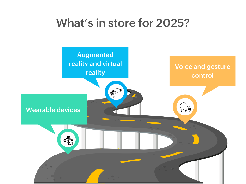
What's in store for 2025?
Presentation design trends in 2025 are expected to reflect advancements in technology, shifts in audience preferences, and evolving design philosophies. While most of the trends we discussed above will most likely hold true next year, here are three emerging design trends that you can experiment with to stay at the forefront of presentation design. 
Augmented reality and virtual reality
Immersive technologies have gained popularity in recent times by promising interactive and seamless digital experiences. Incorporating AR and VR will help you create an immersive presentation experience. They will not only attract and engage your audience but also—with their 3D models and virtual environments—help the audience understand the information presented and retain the message. This will add a lot of value in product demos and trainings because it provides a compelling visual aspect from start to finish.
Voice and gesture control
Own your slide show by using your voice and gestures to navigate between slides, highlight key information, or play a video effortlessly. These features aren't just about being fancy; these are innovative ways to help you deliver engaging and interactive presentations. All you have to do is find a compatible device! Voice and gesture control can provide a smooth and highly interactive presentation experience.
"Watch" your presentations
There has been a significant rise in the use of smartwatches. Around 224.31million users use smartwatches as on 2024. Naturally, the proliferation of this technology will influence the way presentations are conducted. Just like voice and gesture control, you can use a smartwatch to switch between slides, control audio-visual media, and even use a built-in laser pointer. In addition to this, you can also conduct polls, receive real-time feedback, and set timers. Incorporating a smartwatch into your presentation toolkit can provide greater control, convenience, and interactivity, enhancing the overall presentation experience.
Wrapping up
With ever-growing technology, the trends can change rapidly. Staying tech-savvy helps you integrate new tools and ideas into your presentations effectively. However, you don't want to depend too much using the latest style to make your presentation work, and you made need a plan B. Before any speech, presentation, or discussion session, it is wise to check and re-check to make sure all the gadgets function to their best. There's always something that can go wrong, but you can prepare for and manage the situation to connect with your audience despite any technical difficulties.
Happy presenting!


