Elements of a successful homepage
- Last Updated : November 1, 2023
- 1.6K Views
- 16 Min Read

Your homepage is the grand entryway into your digital world that beckons visitors to step inside and explore. Picture it as the virtual handshake that could either compel visitors to dive in or send them away within seconds. It needs to be clear, inviting, and undeniably alluring. The homepage holds the power to not only captivate guests but also guide them toward actions that range from signing up for your offerings to embracing your services wholeheartedly.
Why is your homepage important?
Your homepage is more than just a page—it's a narrative, meticulously woven with elements that hold thought and purpose. But why does it matter so much? Let's delve into its significance and understand how it stands different from other pages.
First impression
The homepage is the primary entry point for plenty of visitors. It has the website's main domain name (e.g., www.example.com). Whether it emerges among the top search results or is accessed directly via the URL, it holds the power to etch an enduring impression.
A well-designed and informative homepage can build bridges of trust or extinguish curiosity in an instant. Unlike any other page, it's the gateway where all the elements of your entire website converge, so it demands an impressive website design with well-written content that can cast a quick spell on your first-time visitors. From the language (which should include powerful adjectives and verbs) to the images (which should be big and prominent), everything on your homepage is designed to grab the attention of your user as quickly as possible. Other pages can still afford to take a few more seconds to impress, knowing well that an interested user has landed on the page after navigating through the website.
Brand representation
In a world where 53% of online explorers seek knowledge before purchasing, your homepage isn't just a window; it's a mirror reflecting your brand's very soul. It's where your identity, values, and personality come together to resonate with those who land upon it. From the brand logo and tagline to color schemes, typography, and images, each visual element speaks volumes.
It's not just the visual aesthetics but also the tone of voice of your website content that will help create a consistent and memorable brand experience. Your articulation, the stories of your users, and the social proof all shape your brand image, creating a story too captivating to ignore.
This is how a homepage stands out from the rest—by highlighting important tidbits from various sections (such as an overview of the brand, key content resources, and testimonials) to give a holistic view of your brand.
Navigation and direction
Your homepage is a guide to your digital realm. When users land on your website for the first time, 38% direct their attention toward the layout and navigational links of a page. Make sure they get what they're looking for.
Summaries and links pave the way, helping your users understand your website's purpose and offerings. They guide them to various sections of your website. They provide an overview of the website's structure and content, making it easier for website visitors to find what they're looking for. While other pages also include navigation menus, they're all modeled around the one on your homepage. It's here that the digital blueprint forms, where the architecture of your website finds its roots.
Website structure
Your homepage is distinct yet interconnected. It houses components that will be common to other pages. The header showcases your logo, tagline, navigation, and user profile link. The footer offers your sitemap links, policy links, and copyright notice. Amidst it all, calls to action (CTAs) are incorporated to entice your visitors to sign up for your content or services. These elements will largely appear in the same form on other pages as well.
Even typography or spacing that appears on your homepage will echo across pages. All of these things put together form the basic structure for your website. It's when you design your homepage that the structure of the entire website comes alive. The website layout, structure, and elements you put on this page will dictate the rest of your website.
The anatomy of a homepage
Now that you know how important a homepage is for your website, let's take a look at the key components that construct a remarkable homepage. They're arranged in a sequence that flows from one website fold to another. Before you ask, the term "website fold" refers to that portion of a webpage that is visible to a user without having to scroll down. It's an important consideration in web design and content creation to ensure that information is immediately accessible to the audience when they land on your homepage, in a descending order of what you think is important or relevant.
First fold
This is the section of the homepage from the top to the end of your screen, beyond which you will have to scroll down, and it should contain all your primary information.
Header
A website's header is the top section that greets your visitor when they land on your homepage. It is a symphony of design, functionality, and branding that sets the tone. Here's what it embraces:
Brand name and logo: The header often includes the website's logo and the brand name next to it (or it can be a wordmark—the brand name in the form of logo), which will help users quickly identify and recognize the brand or company associated with the website. This usually comes at the top-right or in the center of the header.
Slogan or tagline: A mere handful of words, yet they hold the power to convey your brand ethos and promise. If you have one, put it right below or beside the brand logo in neat, legible font.
Announcements or notifications: If there are important announcements, promotions, or notifications, you can place them in a spot that'll catch the user's eyes without being obtrusive.
Navigation: The main navigation menu is typically located within the header. This comprehensive menu contains links to all the main sections or pages of the website, guiding users to navigate easily and find the content they're looking for.
Search functionality: For websites that pack in a lot of content, a search bar should be included in the header, enabling users to search for the right information without seeking assistance.
Login field: If you have a login option, you will have to make sure it appears on the header of your website. Many websites provide the option of logging in with social media accounts or a Google account to make it easy to log in to your website.
User profile link: When your user is logged in, they should be able to access their profile details or their website activities with an easy click on a button at the top-left that can be accessed anytime.
Language selector: Place a language selector on your website header, preferably at the top-right if you have content catering to an international audience who consume content in their language of choice. Experts suggest including a global icon near the language selector field and listing the language choices in the local language or including a map to make it easier for non-English speaking users.
Contact Information: Display contact details such as a phone number or email address on the header. While you can have a designated contact page (that can be listed under the main menu), this can serve as a quick contact info tab.
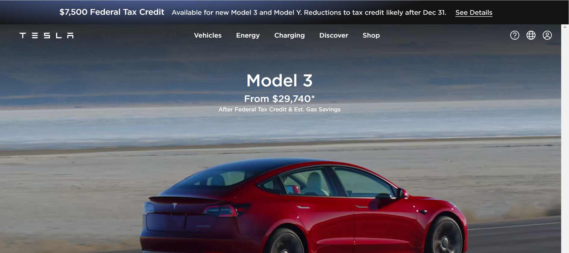
Tesla's website header is a good example. It includes the brand name (that's also a logo), an announcement, main menu, language selector and login field.
Directly beneath the header, another world is unveiled, which will also be a part of the first fold. Sometimes, people choose to make a carousel of banners containing different images, headlines, subheadings, and CTAs. Whether a single item or a carousel, the elements will remain the same, which are listed below.
Hero image
The most important of all the images on your website, the hero image is the large image that people first set their eyes on when your page loads on their device. A lot of thought should be put into getting the right image that conveys what the brand stands for and that creates an immediate positive impression. Sometimes, hero images are replaced with hero videos.
Things to note:
Get the right aspect ratio to avoid the image from awkwardly spilling into the corners. The recommended ratio is 16:9.
Your hero image should create space for your headline, sub-headline, and a compelling call to action. Make sure it has enough negative space to accommodate these elements.
A staggering 74% of users are likely to revisit websites that are mobile-friendly. Make sure your image is responsive so that it gracefully adapts to different screens including desktops, phones, and tablets.
You can use a photo, graphic or illustration, vector artwork, or a band of color (different from the website background) as a hero image.
You need to use color schemes that will go with your brand and something that will encapsulate the essence of your website.
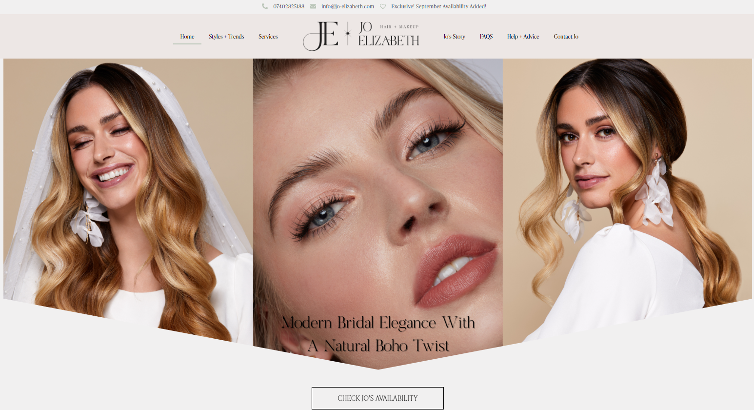
The first fold of a famous bridal makeup artist from London, Jo Elizabeth, uses three photos stitched together with women in white wedding dresses, which immediately conveys visual info about her services. Also, notice how the text is placed in negative space within the hero image.
Primary headline
Whether it's the front page of a newspaper or the digital landscape of a website, a headline isn't just a sentence. It's your chance to make a bold statement about your brand and captivate your audience's attention. That's the impact of headlines. In just a few words, you can convey the essence of what you offer in a way that's irresistible.
Things to note:
Less is often more in the world of headlines. Aim for a concise headline of 6 to 11 words, and don't exceed 50-65 characters.
Ditch the jargon; go for simple yet vibrant words that resonate with your users.
Include powerful, action-oriented words. Think "discover," "transform," and "revolutionize" to evoke emotion and urgency. You can even pose a question that'll nudge your readers to take action and delve deeper into your website.
Don't hesitate to experiment with different headlines. A/B testing reveals the one that speaks best to your audience, driving higher engagement.
Infuse keywords that reflect your website's purpose. This not only boosts SEO but also helps visitors find you effortlessly. Just be sure to avoid keyword stuffing.
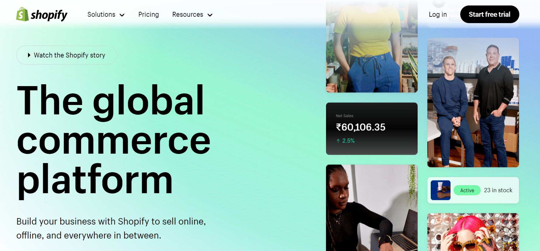
The primary headline on Shopify's homepage reads simple and clear, is concise, and incorporates important keywords.
Subheading
Akin to a supporting character, the subheading complements the headline, providing an extra layer of information. Also known as sub-headline, it's the text that appears below the main headline in smaller font.
Things to note:
10 to 20 words, within 125 characters–that's your sweet spot for subhead brilliance.
Subheading font should be subtle, a bit smaller, sans bold or italics, creating a contrast with the headline.
Give extra tidbits, but don't reveal everything. A well-crafted subheading piques curiosity and invites clicks.
Weave secondary keywords and long-tail keywords into your description to boost your SEO.
Your subheading is a continuation of the headline's conversation. It's part of the narrative–ensure it's consistent with the language and tone of your brand.
The website of All Access Dietitians contains a 19-word subheading in sans bold font, incorporating long-tail keywords like "science of nutrition" or "personal health."

Primary CTA
Steve Jobs, on macOS X’s Aqua UI, said, "We made the buttons on the screen look so good you'll want to lick them." That's how important buttons are when it comes to user interface (UI) and also user experience (UX). In the world of websites, CTAs are the buttons that prompt the users to explore, engage, and convert. They bridge intention and action. Your users should definitely want to click them, if not lick them!
Things to note:
Choose contrasting or gradient colors to make your CTA pop. Shadows add dimension. These will help users easily spot the CTA and encourage interaction.
Ensure the CTA is responsive and works well on all devices, especially mobile. With the growing use of smartphones and tablets, it's crucial that the CTA remains functional on smaller screens.
The size of the CTA shouldn't be huge or disproportionate to the headlines or subheading. Shapes like squares, rectangles, or even elegant circles serve as the background.
Make it unmissable, above the scroll. Your primary CTA should never spill below the first fold.
Keep the CTA text clear, concise, and compelling. Emphasize the value users gain by clicking.
The website of TED, which curates conferences on various subjects, has the perfect headline with 6 words, a subheading of 20 words, and a CTA that urges you to start right away. Notice how its CTA is consistent with the theme, that it's red and is placed against a dark background with light colored fonts within.

Second fold
Once the initial allure of the first fold has worked its magic, the second fold awaits. It's the screen you see immediately after you scroll past the first fold, and it features mid-funnel content in the form of features or benefits that will encourage a visitor to linger on and find out more. Beyond the first fold, users journey further, hungry for more. This is your chance to continue captivating. From extra details and images to CTAs, this fold carries the narrative forward.
Remember that this fold is often used to present:
Features or services/expertise offered: Highlighting the array of offerings is important. Concisely articulate the features, services, or expertise you extend, tailored to your target audience.
Benefits: If features explain what you have to offer, benefits must expound how that is going to help your customers. Paint a vivid picture with quantifiable data, stoking desire and even prompting immediate action.
This information often adopts formats like collapsible menus, a single image on one side with text on the other, compact tiles or boxes with concise information, or organized multi-column sections, ensuring a streamlined and visually engaging experience.
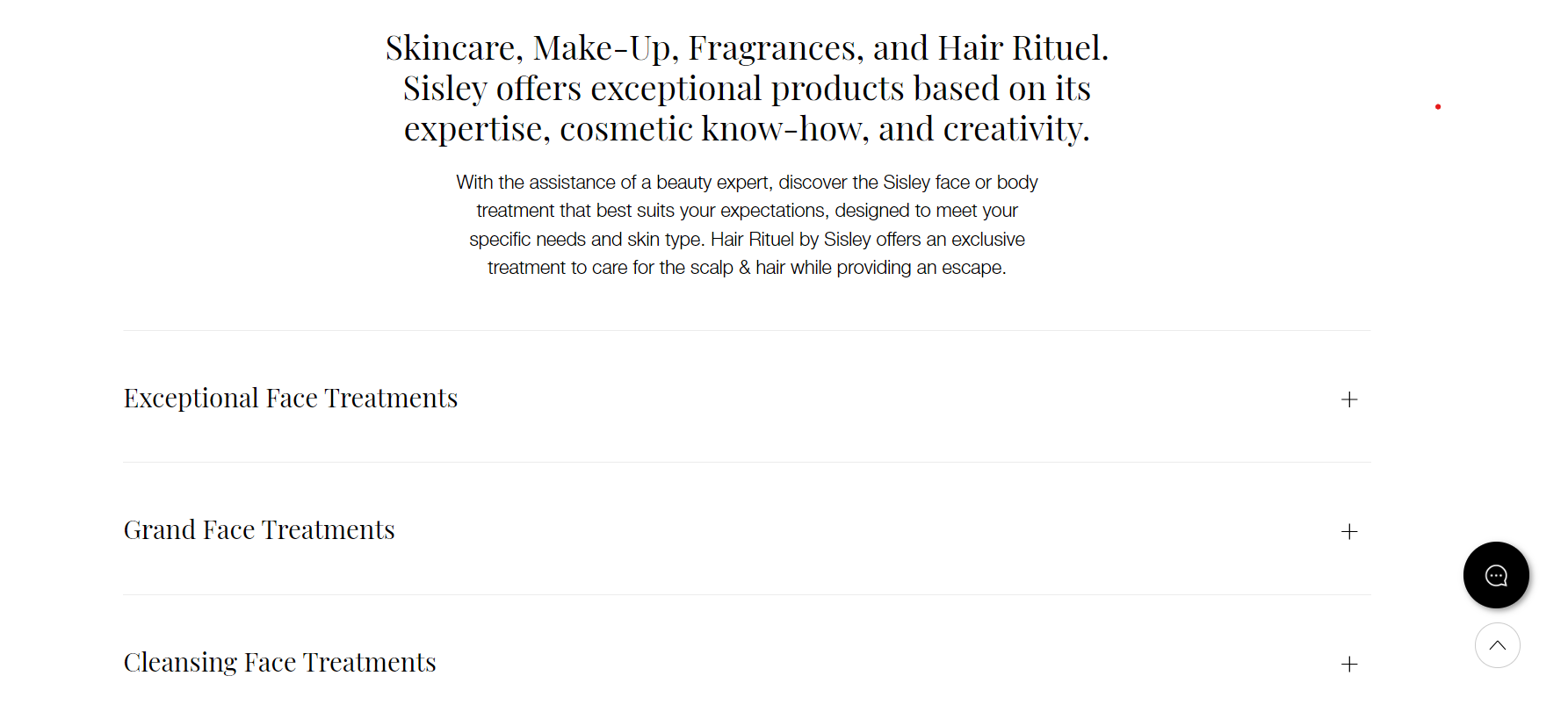
The website for Sisley-Paris salon in New York lists its beauty treatments in the form of a collapsible menu.
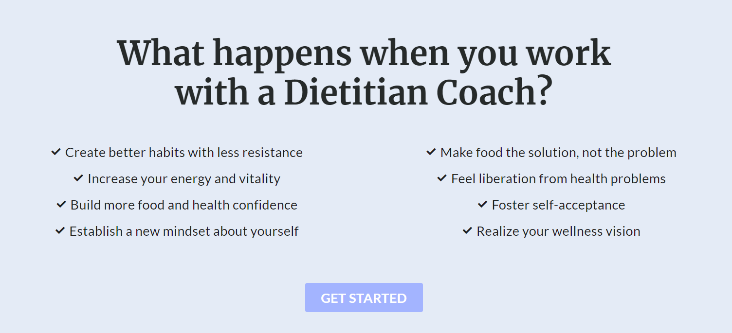
Yet another example from All Access Dietitians has features listed out as simple pointers in two columns.
The elements in the second fold include:
Secondary headline
Craft an engaging secondary headline that serves as an extension of the first or introduces the core topic. Make it intriguing and relevant to capture users' attention.
Things to note:
Ensure your secondary headline has the same font style and font color or something that aligns with the website theme.
Limit the secondary headline to a mere 5-8 words.
Second subheading
Have a good subheading below your secondary headline to elaborate what hasn't been explained before.
Things to note:
Some subheadings can exceed the one in the first fold, while others are shorter and crisp. You decide what kind of content will work better to present the information below.
You can skip it if the secondary subheading is clear enough and this section needs no subheading.
Secondary CTAs
A secondary CTA on your homepage serves as an extra nudge for those customers who are still wondering about you.
Things to note:
Use the secondary CTA in a clever manner. Place it in a spot that offers a set of information that wasn't presented before. That way, you might interest a viewer who may have scrolled past the previous CTA.
Your secondary CTA can't be diametrically opposite from the first. While it can have different background colors, it should have standardized fonts, shadow, or other effects similar to the primary CTA.
Third fold
Beyond the second fold lies the third fold, which is content that's visible after users explore about half or a third of the overall homepage. It's worth noting that precise measurements can't be given due to user behaviors and screens.
The third fold is where you can target partially persuaded users with content that will seal the deal or convince them to come back to you. This section typically showcases:
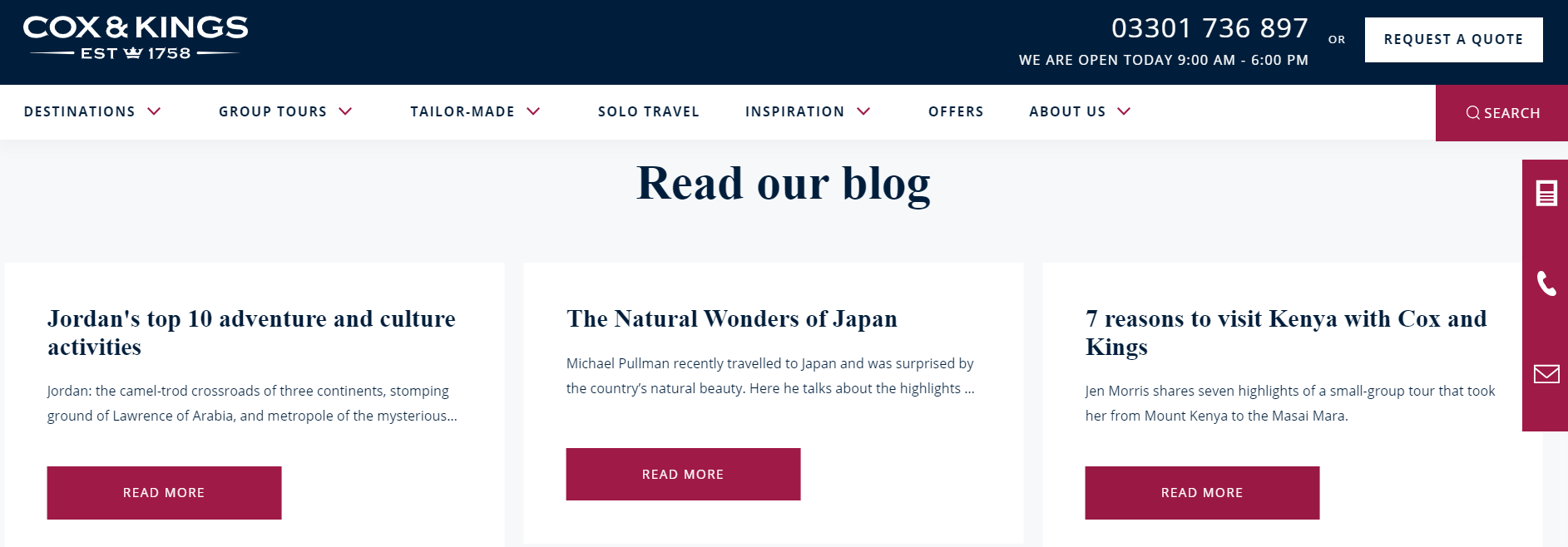
Knowledge resources: Your website is most likely to have blogs or articles, or anything else that'd be educational or informative to your target audience. Present them in this section of your homepage, giving your audience a macro view of the topic on which you're an expert. Share enticing and informative blogs, whitepapers, ebooks, or research reports before users dive into dedicated pages.
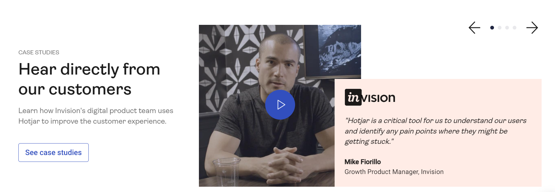
Videos: If you have a video that's relevant to your content, this is a good place to showcase it. Videos can be engaging and help explain concepts quickly. Here's that section from Hotjar's homepage:
Events: Spotlight your participation in expos or events, linking seamlessly to registration forms.
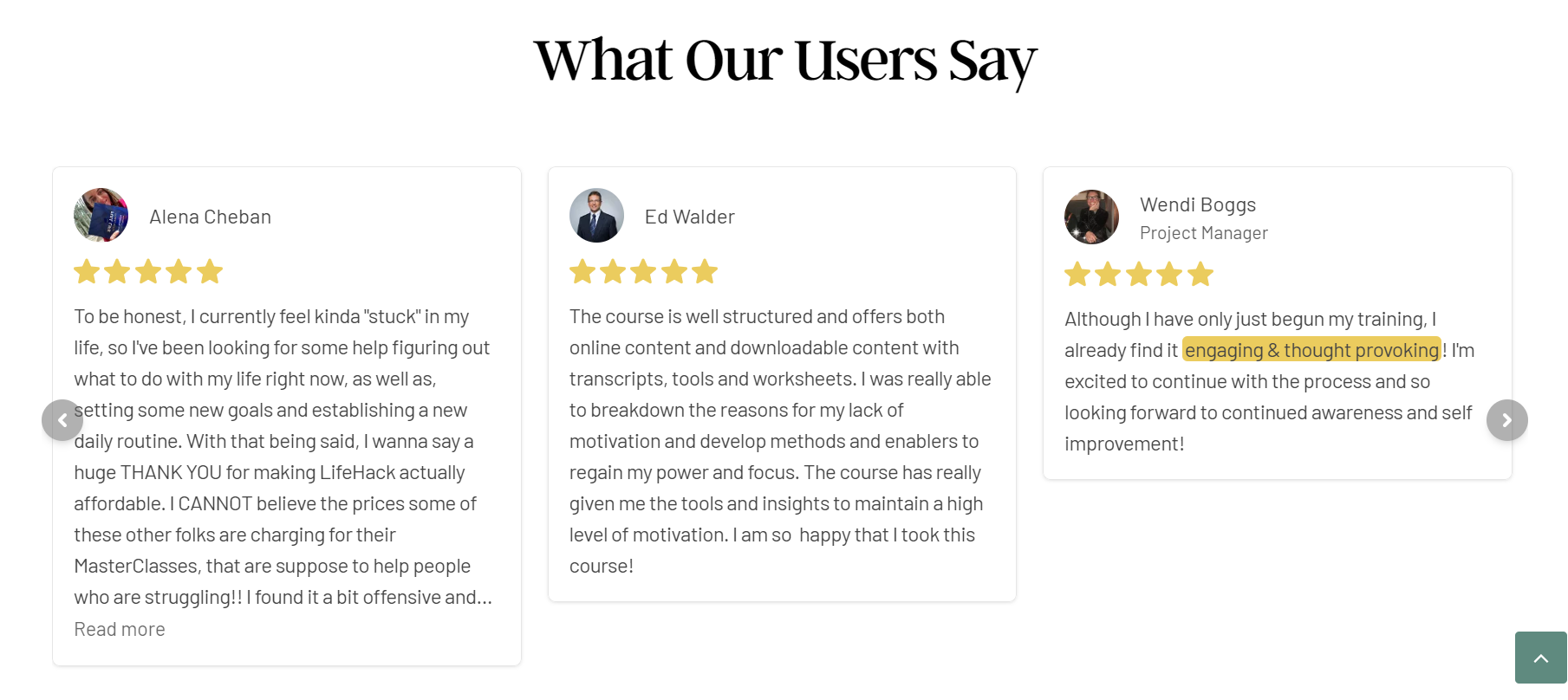
Social proof: Testimonials, case studies, user ratings, or any other kind of social proof are strong indicators of trust. There's nothing like the word of mouth, and what better way to show that through this section! Check out how LifeHack incorporates this below.
When you share these details, be sure to include:
Images: Ensure images are high-resolution and resonate with the nuggets of information you present there, be it blogs or testimonials.
Snippet headlines: This should be in tandem with the content you post here. If it's an ebook or a blog, use the same headline.
Description: Summarize in two to three lines, offering enticing glimpses of resources, events, or testimonials. If it's an event, mention what can one look forward to at it, and if it's a testimonial or case study, focus on the part that highlights how they benefited from you.
CTA: Unlike the previous CTAs, this should encourage the website visitor to read more, redirecting them to the blog page or case study page or any other page dedicated to imparting information or knowledge. "Read more," "Gain insights," "Download ebook," "Read success stories," or "Start exploring" could be a few options.
Last fold
As users continue scrolling, they eventually reach the last fold of your homepage. This canvas unfurls at the very bottom, which users encounter before they depart from the website or move on to another page on it. Remember that the last fold is your final opportunity to engage users and provide them with relevant information. It's important to keep the content clear, organized, and valuable to enhance the user's experience. It should contain:
Secondary CTAs: These could be additional calls to action that persuade users to take specific actions before leaving the page. For example, signing up for a newsletter, following your brand on social media, or exploring related content.
Back to Top button: Including a "Back to Top" button allows users to easily navigate back to the top of the page, sparing them from manual scrolling. This might just be a hack to have them linger on for a few more minutes, which in turn could influence their decision to like or follow your brand.
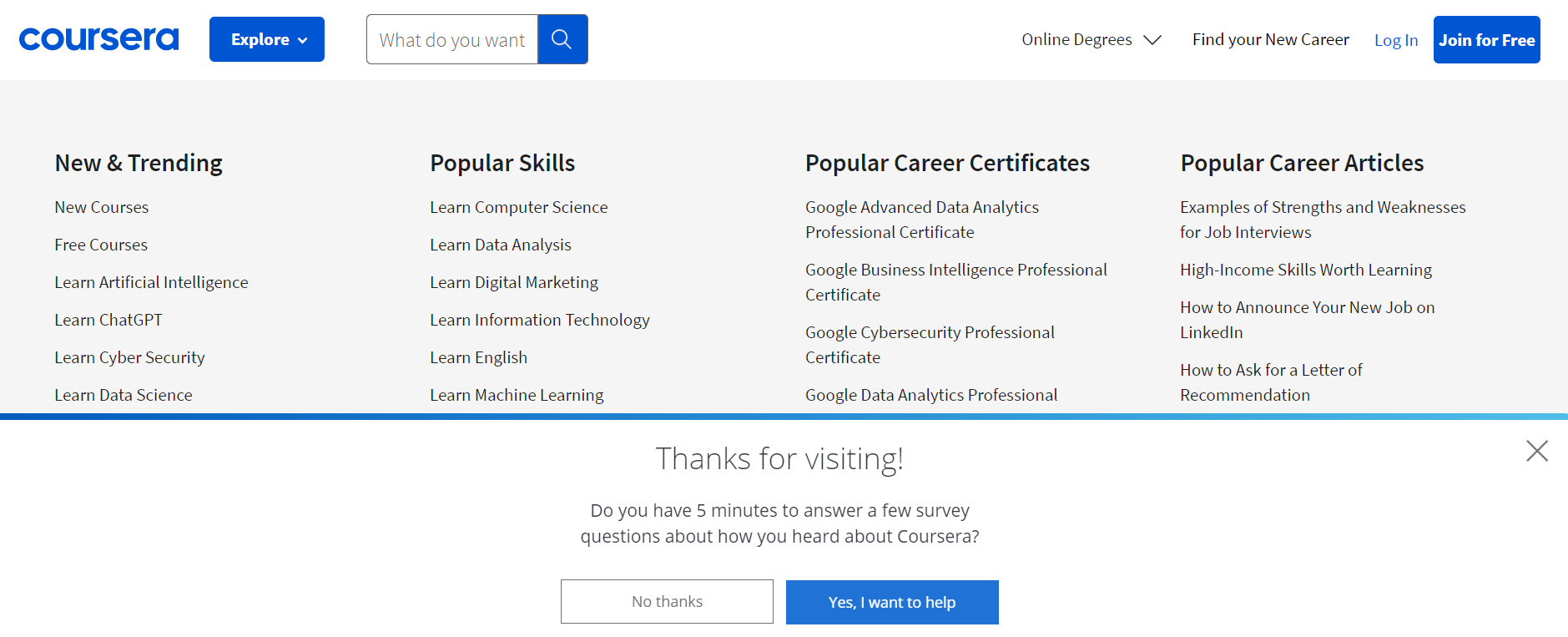
Exit-intent popups: Some websites trigger popups when users are about to leave the page. These popups might offer special deals, incentives, or subscription offers. Or they might even be a quick survey inviting users to share their feedback or opinion about the website or your services.
Live chat or customer support: A floating chat widget may be available throughout the scrolling, regardless of the fold, but make doubly sure it's also present in the last fold. This'll enable users to get quick answers to their questions before they leave the page or website. Here's an example from Drift, a marketing and sales platform:

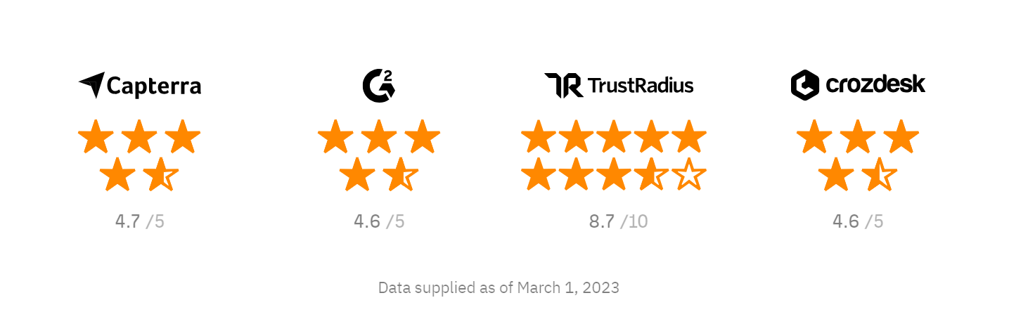
Success indicators: Displaying logos of esteemed clients, coveted accolades, industry honors, security badges, and prestigious press mentions will amplify your credibility, expertise and build trust. Ahrefs displays it in the last fold:
Footer
The final element of the last fold would be the website footer. It provides users with additional information, navigation options, and contact details, among other things. The footer is a consistent area that users can refer to for essential information without having to scroll back to the top of the page. Most of them are dark in color; some in black and some in a darker shade of the brand theme color.
Elements commonly found in a website footer include:
Brand name and logo: Very similar to the header, you'll have to incorporate the name of your brand along with the logo in the footer to ensure your customers properly register your brand and don't forget it in a hurry.
Navigation links: Footers often include secondary navigation links, such as links to important pages like the About Us, Contact, Blog, FAQ, and Terms of Service pages. A link to a site map or index page can help users quickly find the content they're looking for, especially if the website is extensive.
Privacy policy and terms of service links: Footers often contain links to legal documents that outline how user data is collected, used, and protected, as well as the website's terms of use. Links to privacy policy or terms of service or any other policies are mentioned here. Also, links to specific terms and conditions related to user interactions, purchases, or services can also be included.
Newsletter signup: Many websites offer the option to subscribe to their newsletters for updates. This is often included in the footer. Usually, it's a single line inviting readers to sign up with a single field for typing their email address.
Contact information: This can include the company's physical address, phone number, and email address. Some footers also provide a contact form for users to get in touch.
Social media links: Incorporating social media logos directing the users to the company's official social media pages allow users to connect and engage with the brand on various platforms.
Accessibility links: Some websites include links to accessibility features or resources to help the differently-abled to independently use the website. This can include a speech-to-text option or a screen reader or screen magnifier among other options.
Copyright information: The footer typically includes the copyright notice, indicating the ownership and legal protection of the website's content. It tells the audience that the copyright law won't permit them to copy it in any form.
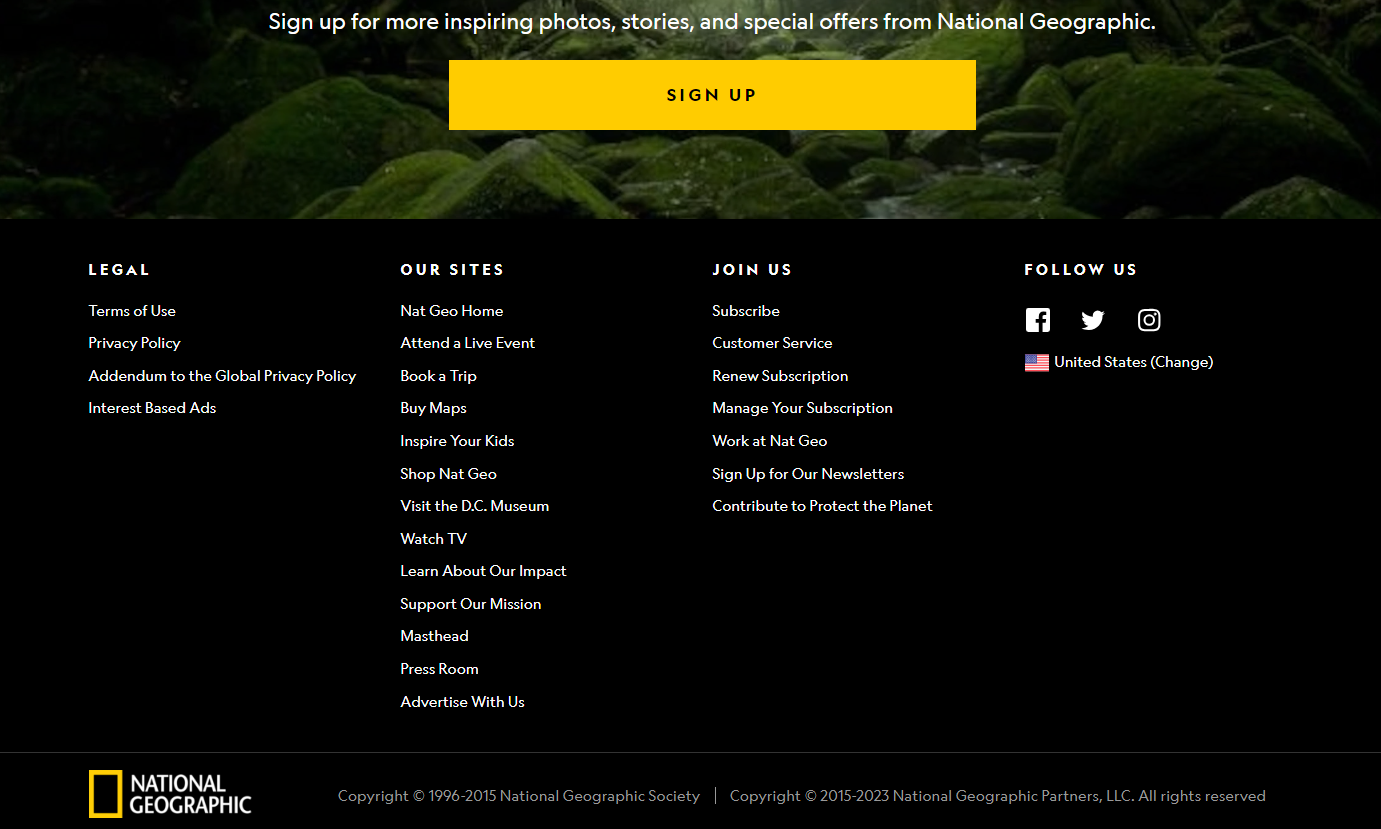
National Geographic's homepage has a well-structured footer.
In conclusion...
The elements that constitute a compelling homepage aren't just individual components but rather a harmonious symphony of design, content, and functionality. From the impactful first fold that captures attention to the immersive second and third folds that continue the narrative, and finally to the thoughtful last fold and footer that ensure a memorable departure, each element plays a crucial role in shaping the user experience.
With a thoughtful blend of design aesthetics, captivating content, and intuitive navigation, your homepage can become a magnetic force that draws visitors in, encourages exploration, and fosters lasting connections.