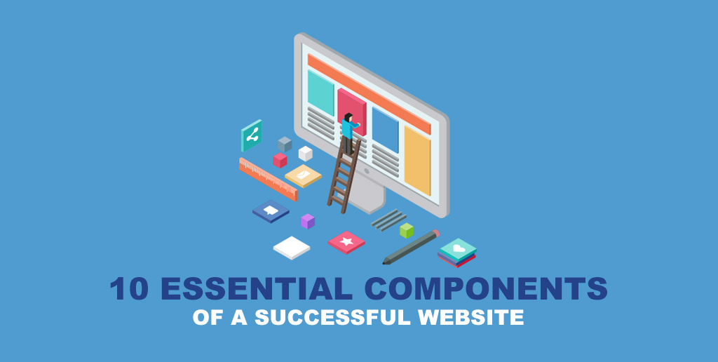
10 essential components for a successful website
- Last Updated : September 19, 2025
- 36.0K Views
- 7 Min Read
A successful website is determined by the number of visitors you get and, most importantly, the length of each visit. The longer they stay, the more they learn about what you have to offer. The aim is to get your visitors coming back for more. This helps increase your site’s ranking and SEO, thereby increasing your online identity. More traffic is also an indication of success and enables more cash flow.
Here are 10 components you should consider while creating your website:
1. A content management system (CMS)
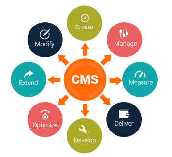
Your content management system works on the back-end to help you organize and maintain various parts of your website. A CMS will manage your website pages and metadata, making it easier for visitors to navigate your website.
If you’re building a website for the first time on your own, consider choosing the best website builder to make the process easier. Builders such as Zoho Sites, Wix, Squarespace, and others each include their own CMS. They also provide templates, function and design elements, customization tools, and web hosting all bundled into one.
2. A reliable web hosting service

Web hosting services make it possible for your website to be viewed on the internet, so paying for a trustworthy one is a great investment. They maintain every web page they host on their servers and handle set-up and other related technicalities.
They also provide high-speed internet connection, good customer service, and support. Most hosting providers require you to own a domain to host with them. If you do not own one already, they will help you purchase one.
3. UX (user experience)
In order to have a successful website, you must ensure that it’s accessible, usable, efficient, and easy on the eyes. Try experimenting with design components such as templates, images, typography, and colors to create and maintain an exceptional UX.
Here are a few must-have elements that will help you create an outstanding user experience.
Mobile-friendly templates
It’s imperative to have templates that are optimized for laptops, desktops, tablets, and mobiles. Mobile-friendly web pages rank higher in mobile search results than non mobile-friendly pages.
Apart from ranking, you should ensure that this optimization provides a fluid viewing experience for your visitors. If your site has a tiny font or images that require a lot of pinching and zooming, you haven’t created the best user experience. Some builders, such as Zoho Sites, will automatically optimize your website for any device.
Navigation
The navigation on your site serves two purposes:
It helps your visitors find what they’re looking for, and
It helps boost your search engine rankings.
Your visitors come first and search engines second. Use words and phrases that your visitors would use while they search. Using descriptive words instead of the generic “What We Do” text makes for fewer clicks. This helps search engines indicate your relevance.
Example: If you have a website showcasing beauty products, you should have pages labeled “Haircare” and “Makeup” so visitors will know exactly what you are offering.
Use attractive calls to action (CTA)
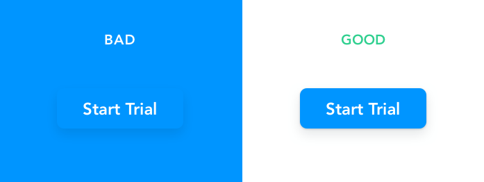
While creating buttons for your website, you should think about colors and the psychology behind them. Different colors evoke different feelings. Consider the message and feelings you want to evoke in a user, such as trust or expertise, and then choose your colors wisely.
A second thing to consider is the words you use for your buttons. It should include an action word that motivates the user to act—a call to action. Choosing the right words creates a psychological trigger that prompts the user to click. No emotional connection means no action. So make your words bold, time-sensitive, and action-oriented.
A great example of good CTAs is WUFOO. The company’s entire page is action-oriented and uses buttons to encourage the user to go to the next step. At the end of the page, you’ll see the use of time-sensitive language like “Sign Up Now” and action-oriented language like “Get Started.” These are active action words that prompt and guide the user to move forward.
Use images (wisely)
People across the internet are getting smarter and faster at judging websites. They can easily detect a generic or non-personal style of stock photography. Unfortunately, these associations reflect on your business and may decrease your visitor’s trust. While stock photographs may be high quality, they often fail to create a connection between the user and the brand.
Only images created specifically for your company are capable of conveying your brand, services, and products the way you want. Make them look professional in order to create trust with your visitors.
Keep your website pages consistent
Consistency means using similar elements throughout your site. Heading sizes, font choices, color, button styles, spacing, design elements, illustration styles, and even photo choices should be themed to make your design coherent throughout.
It is important to create a page flow that establishes your brand. Drastic design changes between the pages in your site could make your visitors feel lost.
Optimized webpages
One of the most frustrating experiences visitors face is waiting for a page to load. With people accessing on various platforms, it’s only natural that they expect a fast result for the content they’re viewing.
High bounce rates are caused when slow-loading pages interrupt the experience of the user and causes frustration.
One way to improve your page speed is to compress all your images before loading them to your website. Large image files are one of the leading causes of slow pages.
Tip: UX 10-Foot Test
Pull up your home page. Now get up from your desk and take 10 steps back from your computer. Are you able to tell what your business does at a glance? Have someone else try it. Can they?
If not, you need to tighten up your message and design. Check out these ten helpful insights to UX design.
4. SEO basics

It’s crucial to optimize your site for search engines. With millions of sites on the internet, there’s always competition for a spot on the first page. You need to figure out which keywords your visitors frequently use to find your site.
Keep regional audiences in mind and try to stick to words that are more specific and local. Implement those keywords wisely in your site copy, metadata, captions, media tags, and file names.
5. Analytics tools
After optimizing your site, you should monitor its growth. Analytical tools such as traffic statistics will help you assess which parts of your site need to be tweaked. You can also gain insight like which pages gain the most visits and how well different elements of your site convert.
You can A/B test to see what works and what doesn’t. Most site builders come with their own analytic tools, but Google Analytics is the most popular and easy-to-use resource. It comes integrated with some builders, such as Zoho Sites.
6. Value proposition
The value proposition or mission statement tells visitors what you do. You can propose this goal in your About page. Be sure to convey exactly what you are about, what services you offer, and why it matters.
Joe Pulizzi from Content Marketing Institute tells us what our mission statement should convey with this example:
[our company] is where [our audience] gets [what information] that offers
[what benefit].
Here’s Orbit’s content marketing mission statement:
The Orbit blog [our company] is where digital marketers [our audience] can find expert, practical advice on web design and content marketing [what information]. Our goal is to help you get better results from the web [what benefit].
7. Testimonial page
A testimonial page is the best place to showcase and market your products and services. When visitors land on this page, they’ll get a fair idea of what you do. This in turn establishes trust between you and your visitors.
There’s a high chance that no one is going to look for pages that praise you. So you need not restrict your testimonials to just the testimonial page. You can also scatter them throughout your site. Find ways to tuck video testimonials and case studies on your home and product pages as well.
8. Email campaigns
Email campaigns are a great way to collect data and track conversions. They are easy to start, measure, and share. You can target a specific market by sending emails to subscribers who meet certain criteria. They are also cost-effective as it doesn’t cost a lot to run a campaign, but the returns are plenty.
The immediacy of email creates instant impact because it conveys a sense of urgency and persuades subscribers to take immediate action. This method enables you to convince impulsive buyers to start right away.
Whether or not you realize it, everybody is trained to do something with an email—reply, forward, click-through, sign up, or even buy. Emails are transactional by nature, and you can use them to direct traffic to your website and ultimately drive sales.
For further insight, take a look at the three phases of email marketing.
9. Contact forms with thank you pages
Your signup forms should contain prominence, proof, and promise. It should be obvious and clear what people are signing up for. Every form should open up to a thank you page. This way, you can set goals in your analytics and track where your conversions are coming from.
You can go the extra mile by adding a subscribe CTA button on your thank you page. It’s better to have a small number of engaged users who are there because they want to be rather than a large pool of people who were baited. Ultimately, clickbait is also bad for your SEO.
10. Social media links and integration

Social media integration helps promote your online business. Using these links on your website will help increase your search engine ranking. Google automatically associates your social media pages with your company when it recognizes these links.
You don’t have to be on every platform, but you should link your site’s social media accounts on the site itself and vice-versa. Some site builders will help you integrate with your favorite platforms so you can post your site updates to your social media accounts at the same time.
Zoho Sites Articles is a forum for businesses that covers a broad spectrum of topics ranging from website creation to marketing. Managed by the in-house team, the forum is regularly updated with information to set up, run, and promote your website.
If you wish to be a part of this dynamic community and share your thoughts or publish an article on the platform, please write us at marketing@zohosites.com.
For support-related queries, please write to support@zohosites.com.
