- HOME
- Website Building
- Homepages
- Optimizing Your Homepage for Mobile Users
Optimizing Your Homepage for Mobile Users
- 10 Mins Read
- Posted on April 18, 2018
- Last Updated on October 8, 2024
- By Lauren
You probably don’t need to be reminded about the statistically massive number of mobile phone users worldwide (a number expected to surpass 5 billion by 2019); or the fact that, a few years back, Google officially announced that more searches take place on mobile than they do on desktop; or the fact that mobile traffic has continued its rise ever since that announcement.
You already know—either intuitively or empirically—that a lot of your visitors will be browsing, searching, skimming, and digesting your site content on their smartphones and tablets.

What this means for you is that you’ve got to optimize not just your homepage, but also your business site as a whole: making it as functional as possible for users, no matter what device they happen to be on.
After all, mobile users will be viewing your site on much smaller screens than your desktop users will, and they’ll be navigating your site with their pointer fingers or thumbs, rather than a with touchpad or a mouse. They’ll be browsing your site in different contexts, under different circumstances, and in different emotional states. These are differences you simply can’t ignore if you want visitors to have a good user experience.
But how big a difference could this really make? Here’s a real-life example of how mobile-unresponsiveness can lose you business in short order. We were on-the-go this week, and decided to drop into a yoga class in the midst of running errands. We looked up Pure Power Yoga, a studio we go to occasionally, on our phone. Our desktop experience on their site has never been a problem. Here’s what their homepage looks like on a laptop:

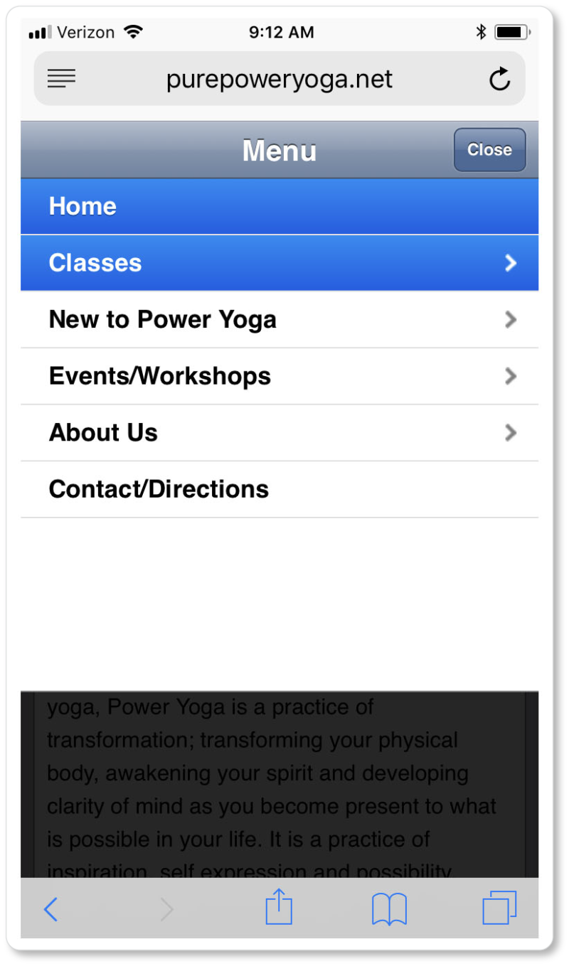
However, on our iPhone, Pure Power Yoga’s homepage looked like this:

A little sloppy and aesthetically disappointing, wouldn’t you say? While the homepage copy is fully accessible, the headline—a quote by the founder of this particular style of yoga that includes a meaningful value proposition worth shouting out—has been cut off. A first-time mobile visitor misses out on the homepage’s most important, and most powerful, bit of copy… and we bet Pure Power loses some prospects through that omission.
But the problem didn’t end there. When we clicked on their menu button, we were shown five different options—none of which worked when we clicked on them. We hit the button for “Classes” again and again, refreshed the page and retried… and the only response we got from the site was that the “Classes” button turned blue:
You can bet we went to a yoga class that afternoon; but it wasn’t at Pure Power, even though theirs was the studio we were closest to as we navigated through town. Instead, we chose a more distant studio whose mobile-responsive design made it simple to find a class.
We’re gonna guess that we’re not the only potential customers Pure Power Yoga has lost through mobile unresponsiveness. So thank them for serving as a cautionary tale for your business… and then get started on your mobile-responsive efforts!
Optimization approaches
You’ll have three primary optimization approaches when it comes to your company website: responsive design, adaptive design, and a dedicated mobile site. Let’s walk through them in brief.
Responsive Design
A website that employs responsive design adapts dynamically to whatever device, platform, screen size, or browser width a visitor is viewing it on. Thus the same content displayed in a three-column format on a desktop might display in a single-column format on a mobile phone, so that users can navigate easily without having to zoom in and out.
If you’re viewing a responsive website on a desktop and you adjust the size of the browser window, the content will dynamically adapt, rearranging itself to fit the new window. In other words, with responsive design, the site elements fit whatever space is available: The CMS detects the dimensions of the screen and responds accordingly. And regardless of device, with responsive design the user pulls up the same URL, the same HTML code, and the same content.
Mobile-dedicated Design
A mobile-dedicated site is specifically designed for mobile devices and for serving up content to mobile users. It typically lives under a separate URL from the main site (m.mainsite.com or mainsite.com/mobile), has a distinct HTML code, and is lighter on content than the main website. And rather than rearranging page features—as responsive design does—it contains different features, appropriate to mobile devices.
Adaptive Design
Adaptive design (or dynamic design) means preparing three (or more) different versions of your site (desktop, mobile, and tablet). As in responsive design, the server detects the device… but rather than rearranging all the content to fit that device’s screen size, the CMS sends only the content and features coded for that device. Thus, if a user is browsing your site on an iPad, they’re only seeing the tablet version of your site, which has a different template—and different content—than, say, the mobile version.
There’s plenty of information (and there are plenty of opinions) out there about the pros and cons of each of these strategies; and as the technology (and Google’s response to it) continues to change, it may be worth asking how these changes will affect your approach to optimization… especially as mobile continues to outpace desktop as users’ device of choice.
One site, many devices: a case for responsive design
Responsive design has become easier and easier to implement over the years, thanks to the growing availability of responsive themes and templates in website builders such as Zoho Sites, WordPress, Squarespace, Wix, and Weebly. While it won’t offer you as much control as adaptive design does, it takes less time and energy to build and maintain, thanks to these evolving technologies.
That’s why responsive design remains such a popular option. Developers, web designers, and business owners without much experience will find this design strategy much easier to work with than mobile-dedicated and adaptive design. What’s more, responsive design works particularly well for businesses that find there are only minor differences in user intent between their mobile and desktop users.
In other words, their site users want the same options on their smartphones as they have on their desktops. Because, in the end, it’s all about your user.
The online retail shop Skinny Ties exemplifies a solid responsive design strategy. Their homepage on a laptop looks like this:
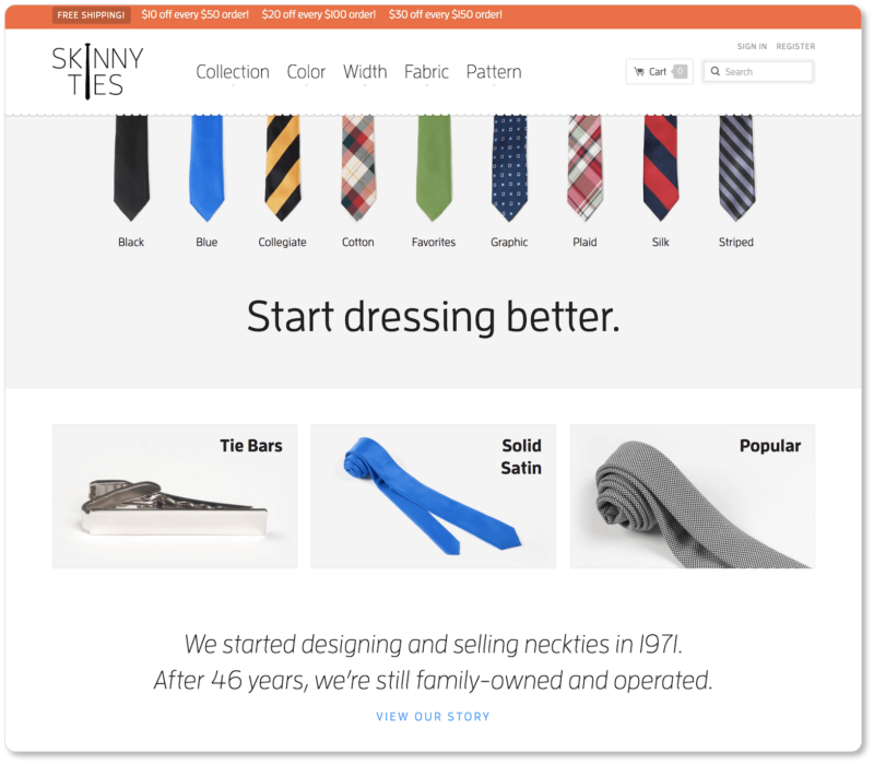
Indeed, as we resized our browser screen on our laptop, the page elements rearranged themselves to fit the smaller screen size (notice how the “Popular” category now sits beneath the other two categories): 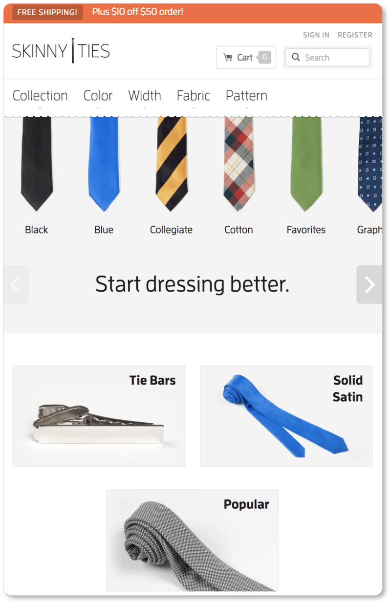
Now here’s what Skinny Ties’ homepage looks like on mobile:

You’ll notice that the same content appears on Skinny Ties’ mobile site as appears on its desktop site. On mobile, however, the content has been rearranged and is stacked vertically, rather than displayed horizontally.
In addition, while the main menu options remain the same, the words “Cart,” “Sign in,” “Register,” and “Search” have been replaced entirely by icons (cart, headshot, magnifying glass) to save space in the mobile version. And the deals announced in the banner at the top of the company homepage are reduced from three to one on the mobile page.
So you see, there is a little room for difference across platforms in responsive design; but the point of this strategy is that you get to serve up the same content to your users, whether they’re browsing your site on their laptops or their mobile phones.
Pro tip: Your CMS may already be “considering” responsiveness for you, but that doesn’t mean you should simply trust that it’s doing that work flawlessly. Spend time on your site on both your phone and tablet to see what the experience feels like on those devices. Remember, optimizing for mobile means more than ensuring your design fits the dimensions of the smaller screen. The entire experience needs to provide good UX.
Taking user context into consideration: a case for dedicated mobile sites and adaptive design
The optimization path you choose will be a matter of cost, as well as what resources you have for things like page maintenance and SEO across multiple domains and site versions.
But just as importantly, you’ll want to consider your visitors’ context when deciding how to optimize across devices. (This is part of understanding your customer persona, by the way.) Talia Wolf at GetUplift says it beautifully:

You might discover, for example, that visitors come to your eCommerce site to browse and add products to their carts on mobile, but wait until they get home to make purchases from their desktops—either because that’s where their credit cards are, or because they feel more secure making purchases from their home internet connection.
On the other hand, it’s quite possible that mobile users will be more interested in actionable tasks on your site (like making a purchase) than they’ll be in reading your content, which they’ll reserve for their large-screen time. When the pizza chain Domino’s realized that mobile users were more likely on their site to order a pizza than they were, say, to apply for a job, they launched a dedicated mobile site to reflect users’ objectives, and sold a million dollars’ worth of pizza in Australia within a week of their mobile site launch.
So while responsive design remains a popular optimization strategy, the one-size-fits-all-devices approach may not necessarily be the best route for your business website. Some of the top eCommerce retailers—such as Amazon, Staples, and Zappos—have opted for dedicated mobile sites rather than responsive design.
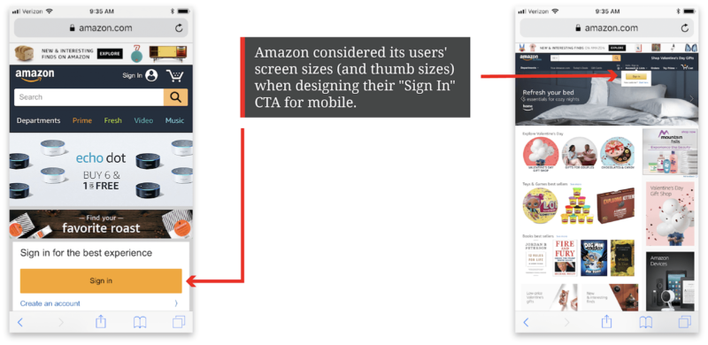
Amazon allows mobile users to toggle between its mobile site and its “full site,” and the difference in UX between the two is readily apparent. Imagine trying to hit that tiny “sign in” CTA with your unwieldy thumb on their full site (the screenshot on the right):
Notice, too, how Amazon’s navigation menu on their mobile site is limited to five items (Departments, Prime, Fresh, Video, Music), while their desktop menu has eight. It’s possible you’ll decide to give your mobile users different (typically fewer) options than you give your desktop visitors; adaptive or mobile-dedicated design will then be your two best options.
The best practice for mobile navigation is the “hamburger icon”: those three horizontal lines that have come to signify the menu hidden behind them. Here’s how Moz’s main menu looks on both desktop and mobile:

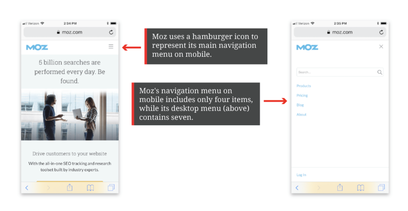
It’s worth paying attention to what Moz decided not to include in their mobile menu, as their site exemplifies a thoughtful determination that desktop and mobile navigation items should differ. For example, the menu option to “Learn SEO” on desktop disappears on mobile—likely because the company determined that when mobile users clicked into their site, it wouldn’t be to spend hours in their learning center. (Users probably use their desktops for SEO study sessions.)
On the other hand, Moz kept their “Blog” item—possibly for visitors on the go who use their morning train commute to catch up on shorter pieces of content. And they included a “Pricing” item, which doesn’t exist on their desktop menu. It’s possible Moz realized that users who purchase their services on desktop come to their homepage first to do their research, so it doesn’t make sense to give the pricing up-front. Mobile users, however, may have proven readier to buy.
From both a design and a content perspective, you can see why the optimization question is an essential one to consider before you even start imagining your homepage… let alone your entire website. After all, responsiveness needs to be considered at the design stage, and homepage elements (such as your main menu, your images, and your footer) may be different across site versions if you go for adaptive design or a mobile-dedicated site. This will mean devoting some hours to mapping out various templates—quite possibly with a web designer.
Which optimization strategy do I choose?
For most small businesses, it won’t make sense to have a separate strategy for mobile visitors, and responsive design will still be the best option for your site. But for other businesses (both small and large), this won’t be a sufficient optimization strategy.
If your site requires a lot of user interaction and navigation; if you’re doing a lot of online business or making a lot of online sales; if your site entails the completion of complex visitor tasks; or if you’re simply clear that your mobile users arrive to your site with different objectives than your desktop users do, then you’ll probably want to customize the user journey for each device.
The point is that as you analyze intent when envisioning your visitor personas, you don’t limit that intent to desktop. What are their mobile-specific behaviors, priorities, and goals? How are these different from their desktop behaviors, priorities, and goals? Their tablet behaviors, priorities, and goals? Craft your content around your answers to those questions. User experience should be guided by user intention on every possible user device.
We recommend that you take a close look at some of the sites on the Awwwards winners for Best Responsive Design, Device Atlas’ list of 10 Great Examples of Adaptive Web Design, and the sites of the companies we mentioned above that opted for dedicated mobile sites. Consider the differences between desktop, mobile, and tablet versions in terms of design, aesthetics, UX, and user journey across these different optimization strategies.
Can you articulate why that company may have made the design decisions they did? Can you imagine yourself as the mobile user who’s trying to quickly navigate that company’s site while on the run? What about that desktop user, who may be clicking into the site with a little more time, a little more patience—and perhaps a little more trust about making a purchase from their home network?
Remember, the ability to critique other business websites is a practice—and, eventually, an art—that will be a tremendous help each time you turn back to your own site.
Whether on desktop or mobile, the images and videos you display on your homepage are as important as any other element you can offer your visitors—and they’ll catch users’ attention before anything else on the page. In the next section, we offer tips and tricks for your homepage multimedia, including what kinds of images drive conversions, how to optimize them for SEO, and where to find them if you don’t have the resources to make your own.