- HOME
- Website Building
- Business Blogs
- Using Compelling Featured Images on Your Blog Posts
Using Compelling Featured Images on Your Blog Posts
- 7 Mins Read
- Posted on April 14, 2018
- Last Updated on October 8, 2024
- By Lauren
We probably don’t have to tell you how important an image is. Your images are the first things visitors to your blog will see. And your featured image should help them determine what your post is about.
 The featured image for any given post should be the same on both your blog’s homepage (generally as a smaller thumbnail image) and on the individual post’s page (generally as the hero image); so if your CMS theme doesn’t automatically make your featured image the hero image, you’ll want to enter it manually.
There are two reasons why this visual consistency is important. In the first place, when a user sees the same image on your inner blog post as the image they clicked into, they’re assured that they’ve come to the right place. In the second place, the featured image functions as the visual representation of the post you have assigned it to… and you don’t want to confuse users who may see your post in more than one place.
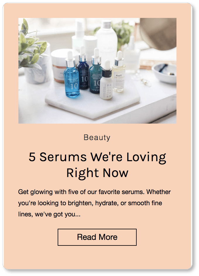
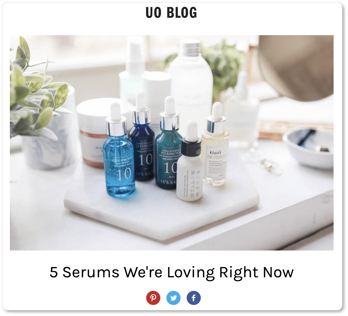
Here’s how the blog at Urban Outfitters does it. (The first image is from the blog’s homepage; the second image is the hero image the visitor sees when they click on the “Read More” CTA):
Here are our recommendations for your featured image:
Make it relevant to your post
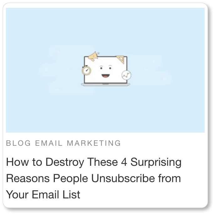
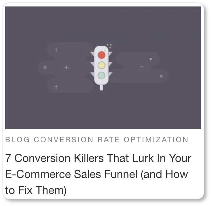
This may seem obvious; but from some of the blogs we’ve seen, it’s worth lingering on for a moment. Take these examples from Sleeknote’s blog:
We think we understand what Sleeknote is up to from the point of view of branding: Their images are consistent from a design standpoint, and there’s a cuteness factor that the lead capture form company is obviously trying to cultivate.
Still, we’re not sure what a smiling computer screen with an alarm clock, a horn, and a set square emerging from it has to do with deterring unsubscribes. And a stoplight could be a symbol for just about anything; but Sleeknote wants us to interpret it as having something to do with a sales funnel’s drop-off rate. Once again, the relationship isn’t clear.
We have to read Sleeknote’s blog titles to understand what their images are trying to do. This should not be the relationship between your blog content and your featured image. Your featured images (as well as any images you use in your blog posts) should be “explainer images”: They should add value by virtue of the fact that they help demonstrate what your text is about.
Here’s an example from Instapage’s blog. (We chose Instapage because, like Sleeknote, the company generates lead capture forms. Instapage proves it’s possible to find or produce relevant featured images no matter what your industry is):
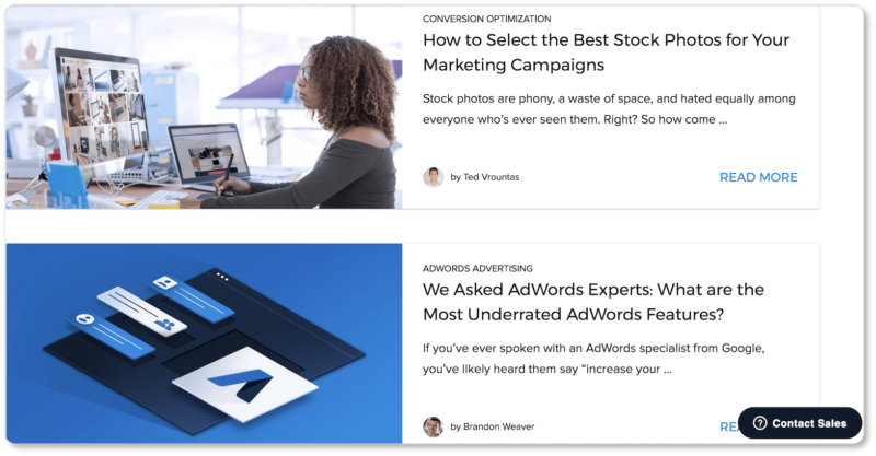
For their post on selecting stock photos, Instapage uses an image of a woman in front of a computer screen who is quite evidently on a search… for images. Visitors to Instapage’s blog would quickly recognize the kind of research she is doing—possibly even before they read the post’s title—and might find themselves sympathizing with her search. And those sympathetic visitors? They’re all the more likely to click in.
As for the second post, Instapage’s featured image includes the Google AdWords logo. A visitor to the blog who works with AdWords would recognize it immediately. In addition, those AdWords elements are hovering over the page and appear to be repositioning themselves—even if only slightly. The image seems to promise a “shifting” perspective on the advertising service… and the post provides this by pointing at some of AdWords’ most often-overlooked features.
So take a tip from Instapage: Relevant featured images are always possible. One strategy you might use as a “relevancy test” is this: Show your featured image to someone who hasn’t read your post, and ask what you think a post connected to this image would be about.
Keep it simple and clean
Remember that the image is there to help visitors figure out what your post is about: The more quickly they know the answer to this, the more quickly they’ll click in. This means your images should be minimalistic and quick to decipher. If there’s too much going on, it’ll take your visitor more time than necessary to “see” and interpret the image.
Here are two card images, from Allstate’s and Web Designer Depot’s blogs, respectively:


Whereas we clearly decipher a tent in the top image (the post’s title is “New Outdoor Gear for Campers“), the bottom image, from WDD’s “Popular Design News of the Week” series, takes us longer to comprehend. The photograph is cluttered and busy—in the first place because many things are happening at once inside this cafe, and we don’t know whom we’re being asked to direct our attention to. In the second place, the photo has also obviously been taken from outside; and the reflections in the window complicate our capacity to visually put the scene together. And we promise you, we don’t like to work that hard.
So for your visitors’ sakes, choose simplicity, and keep your images clean.
Make it SEO-friendly
By SEO-friendly images, we mean (at least) three things:
- You’re making good use of alt text by inserting keywords into your featured image titles.
- Your images are not only high-resolution (this keeps visitors on your page, which means increased dwell time); they’re also mobile-responsive, and look good on any screen size.
- Your images don’t slow your page load time. There are ways to keep your images looking high-quality while keeping the file size low. If WordPress is your CMS, tools like the WP Smush Pro plugin will condense your image file sizes. And the image optimizer Optimizilla is another great option… regardless of your CMS.
Stay legal
If you’re not taking your own photographs (or if your designer isn’t creating your images), make sure the images you’re using are being used legally. In other words, don’t just do an image search on Google and grab the first thing that resonates with your post. Seriously! Doing so may open you up to major problems down the road—including cease-and-desist letters, demands for payment, and even litigation.
If hiring a photographer or buying yourself a good camera and learning the basics isn’t in your budget, you’ve got a few other legal options:
1. Royalty-free images can be found on sites like Shutterstock. Shutterstock asks for a one-time-fee for its images; and restrictions on how you can use the images you purchase are minimal.
2. Creative Commons allows creators to license their works for distribution (HubSpot offers a breakdown of the types of Creative Commons licenses out there). Last year, the non-profit organization Creative Commonsunveiled a new photo search engine. If you go this route, one thing to keep in mind is that with Creative Commons, attribution is a requirement.
3. Images in the public domain (found on sites like Pixabay) aren’t copyrighted at all. Attribution is sometimes still a requirement, so pay close attention to the terms of the photo-sharing site you’re using.
Hubspot offers a list of 20 of the best free stock photo sites; so does Ramsay Taplin of the Blog Tyrant in his “Complete Guide on How to Find Images for Your Blog.”
Reflect your brand
Whichever route you take to find your blog images, make the time to choose the ones that genuinely resonate with your offering, your brand, and your vision. Over the long haul, your blog images will actually become a part of your brand, and you’ll want visual consistency of some kind. Here’s an example from Instapage:
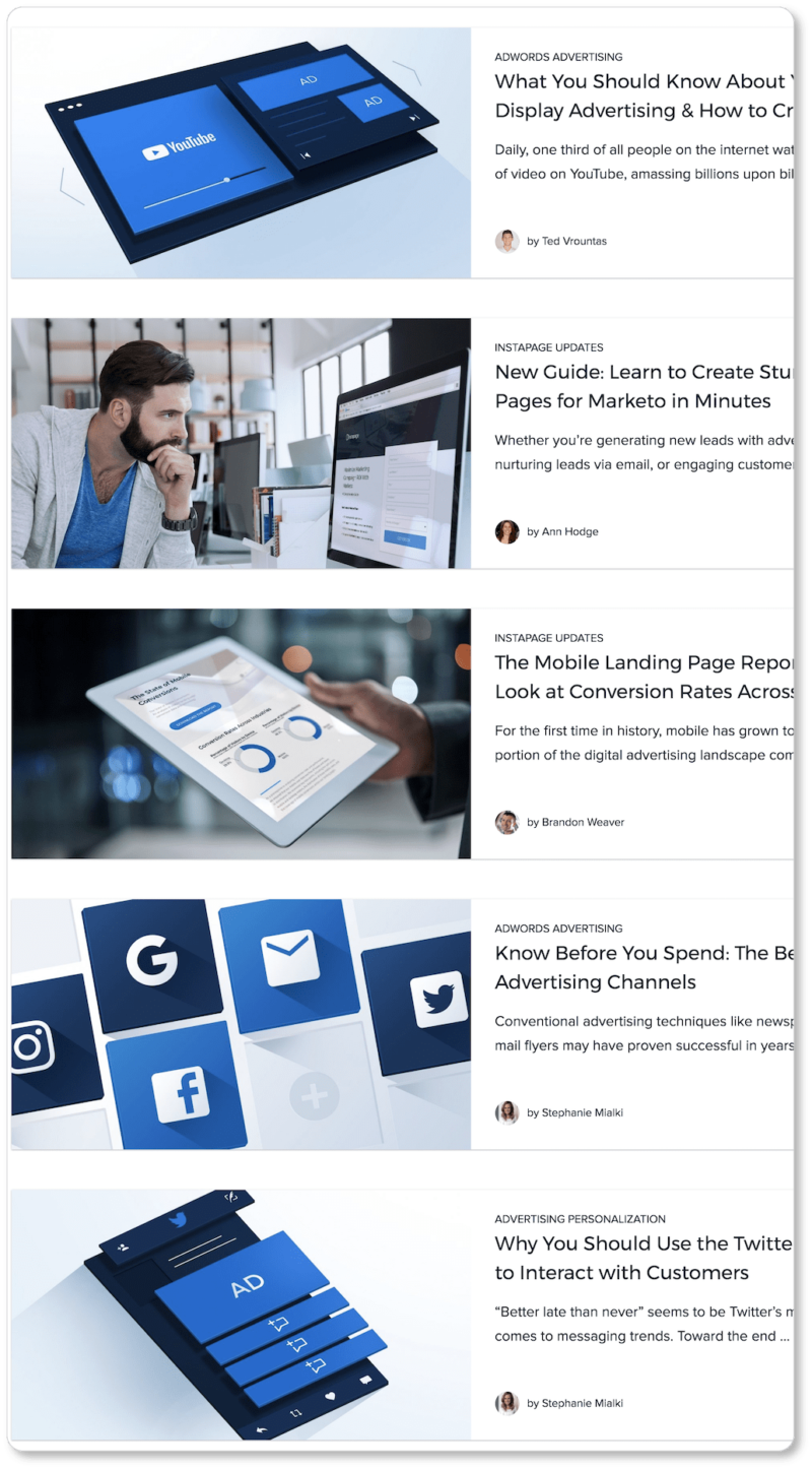
It’s worth going back into the other blogs we point to above (Urban Outfitters’ and Sleeknote’s in particular) to observe how that consistency plays out in their branding. Then it’s your turn: Click into the homepages of some of the best business blogs you can think of, and see how their blog post images support their brand.
A blog that’s aware of its role in the company brand will have a cohesive presentation, a fairly consistent color scheme, a steady style of imagery, and a unified voice. Remember, one underlying goal of all your content marketing efforts is to humanize your business. Your blog shouldn’t present itself as the equivalent of that fickle or volatile friend whose mood you can never determine. Help your prospects trust that you’re a steady “character” with a steady presence. That confidence can only lead to customer loyalty in the long run.
So we’ve got your content and your featured images covered.Now the question is how to design your blog to make your content easily navigable, your best posts readily available, your conversion path evident, and your page a delight on the eyes. In the next section, we’ll cover each of these design elements—and more.
